CASE STUDY:
VÉRA BOTANICALS



SCROLL
PROJECT DETAILS
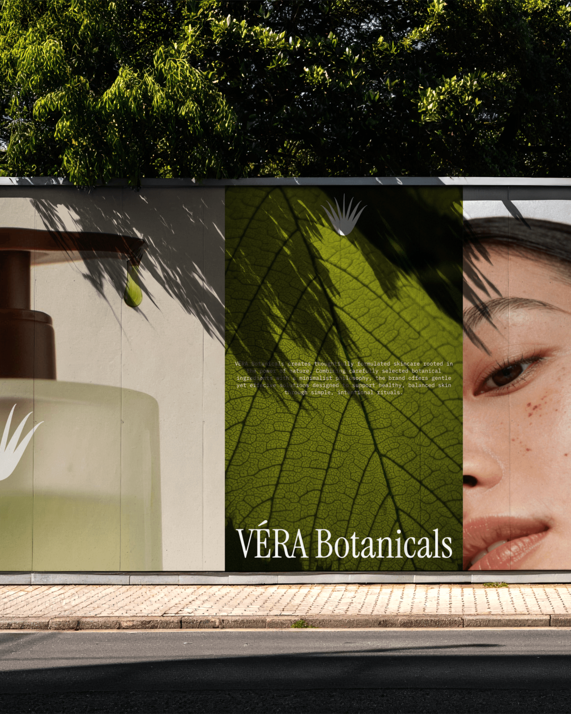
VÉRA Botanicals is a premium skincare brand focused on plant-based formulations and slow beauty rituals. The brand positions itself as a quiet, refined alternative to overly clinical skincare, emphasising natural ingredients and intentional routines.
The project involved developing a complete visual identity system and packaging design. The objective was to create a brand that felt elevated yet grounded, combining botanical softness with editorial precision.
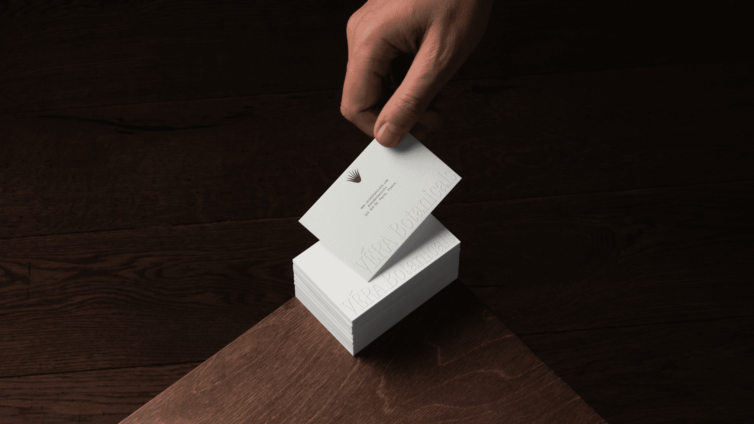
The visual identity was designed to feel timeless and restrained, allowing the product formulations and ingredient storytelling to take precedence. Packaging layouts were intentionally minimal, using refined typography and carefully considered spacing to convey a sense of calm luxury.
INDUSTRY
Beauty (Skincare) & Wellness
YEAR
2026
SERVICES
Branding & Packaging Design


FINDING THE VISUAL WORLD
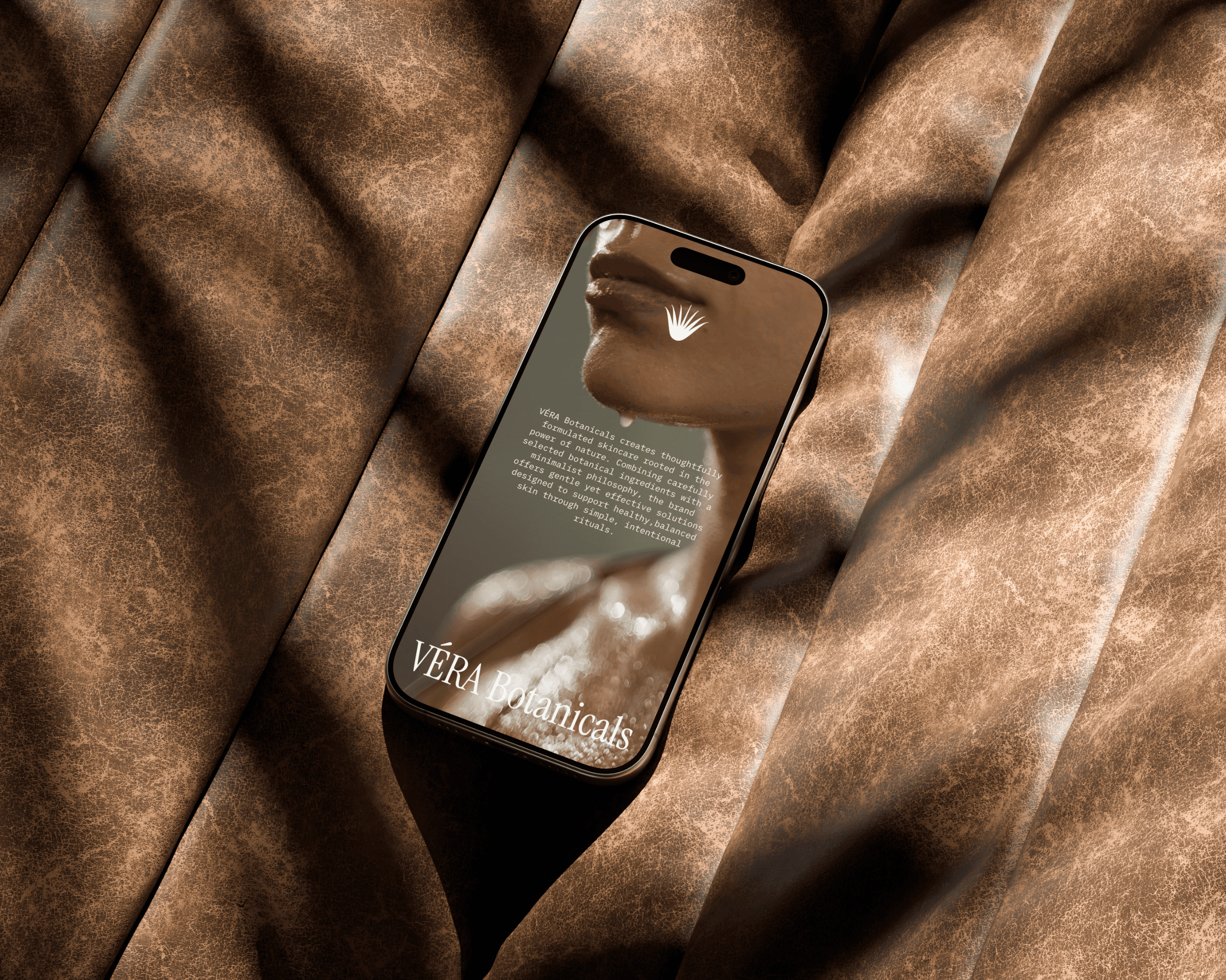
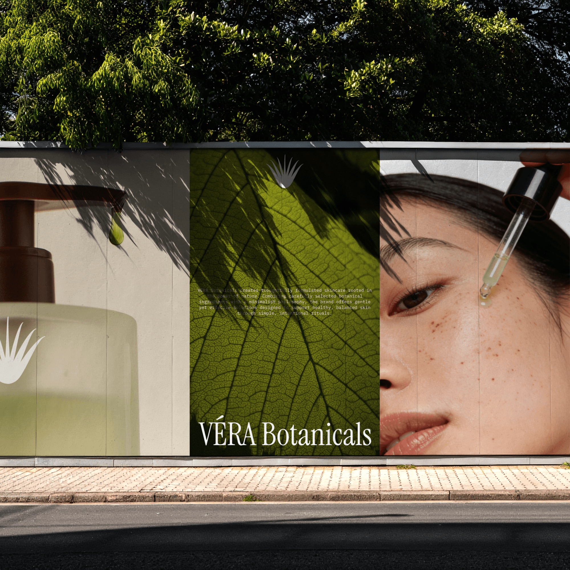
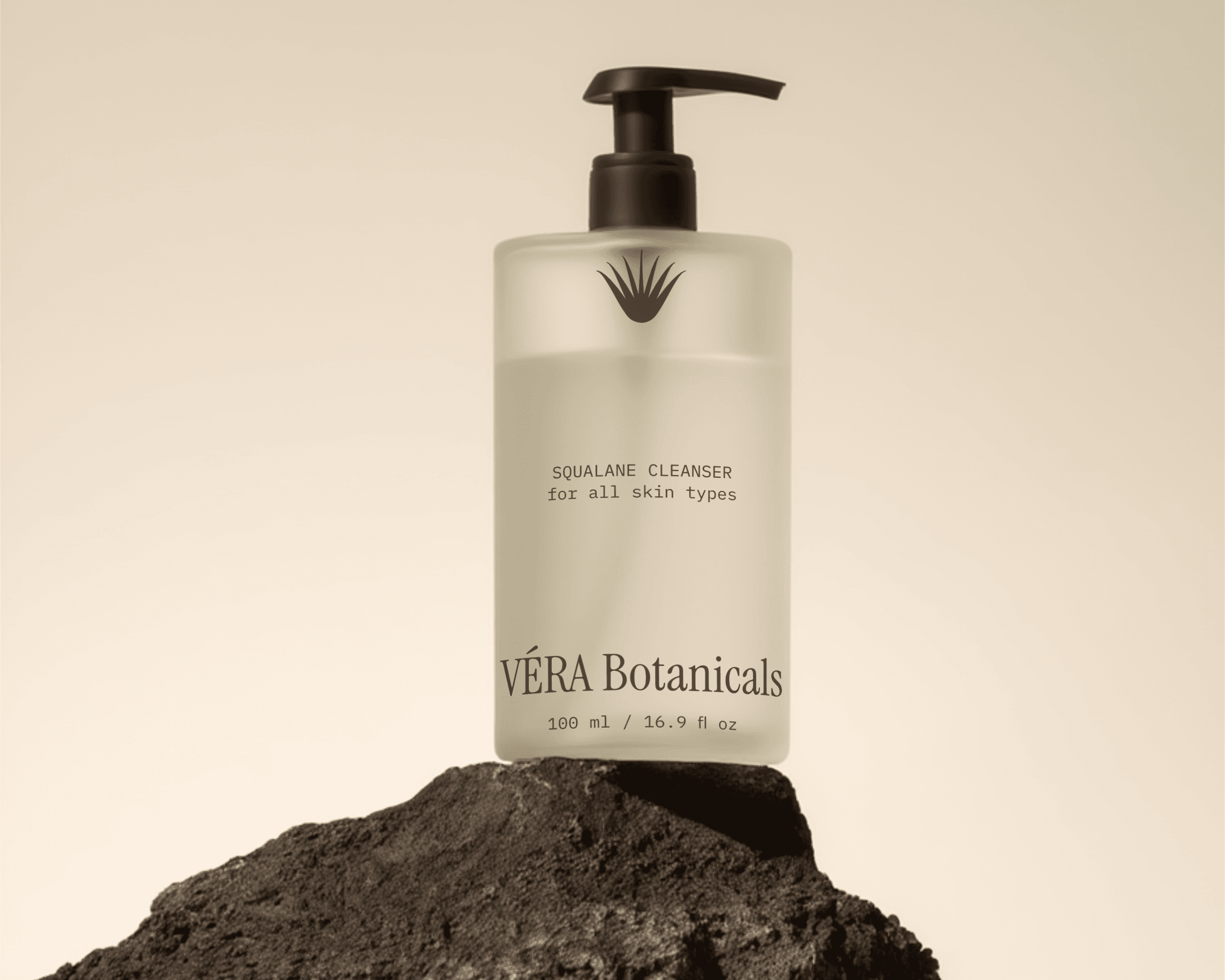
VÉRA Botanicals is a plant-based skincare brand built around cleanliness and nature. Their formulations are considered, botanical, and intentional.
The challenge was that restraint is sometimes harder to design than complexity. When you strip away decoration, every remaining choice carries more weight.
Before I began designing, I spent time understanding what "elevated yet grounded" actually looks like. I kept returning to a specific feeling: the aesthetic of a clean, organic, carefully kept home, where every object has been chosen deliberately and nothing is there by accident.
The name itself — VÉRA, from the Latin for "true" — kept guiding me back to authenticity. There's no room for performance or exaggeration in this identity. Instead, the brand embraces realness and honesty about what the product is and where it comes from.
THE LOGO
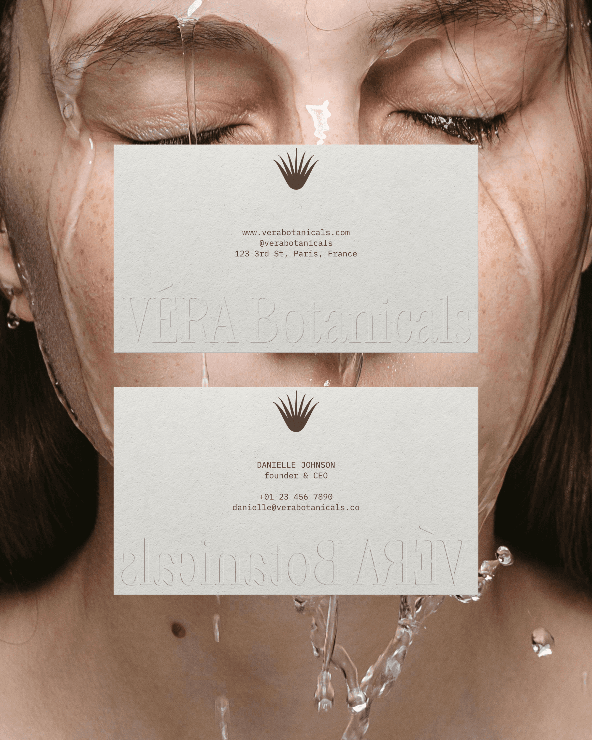
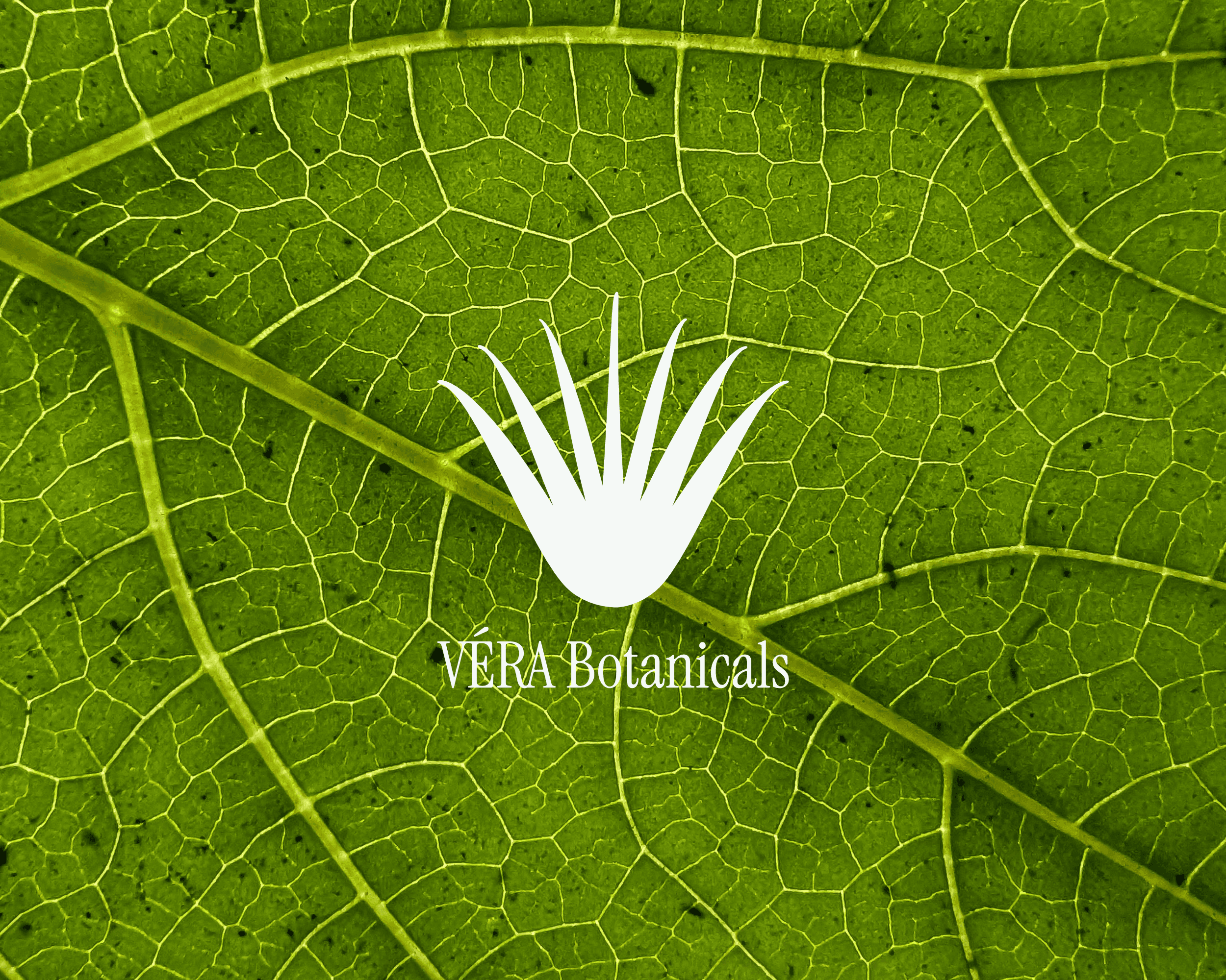
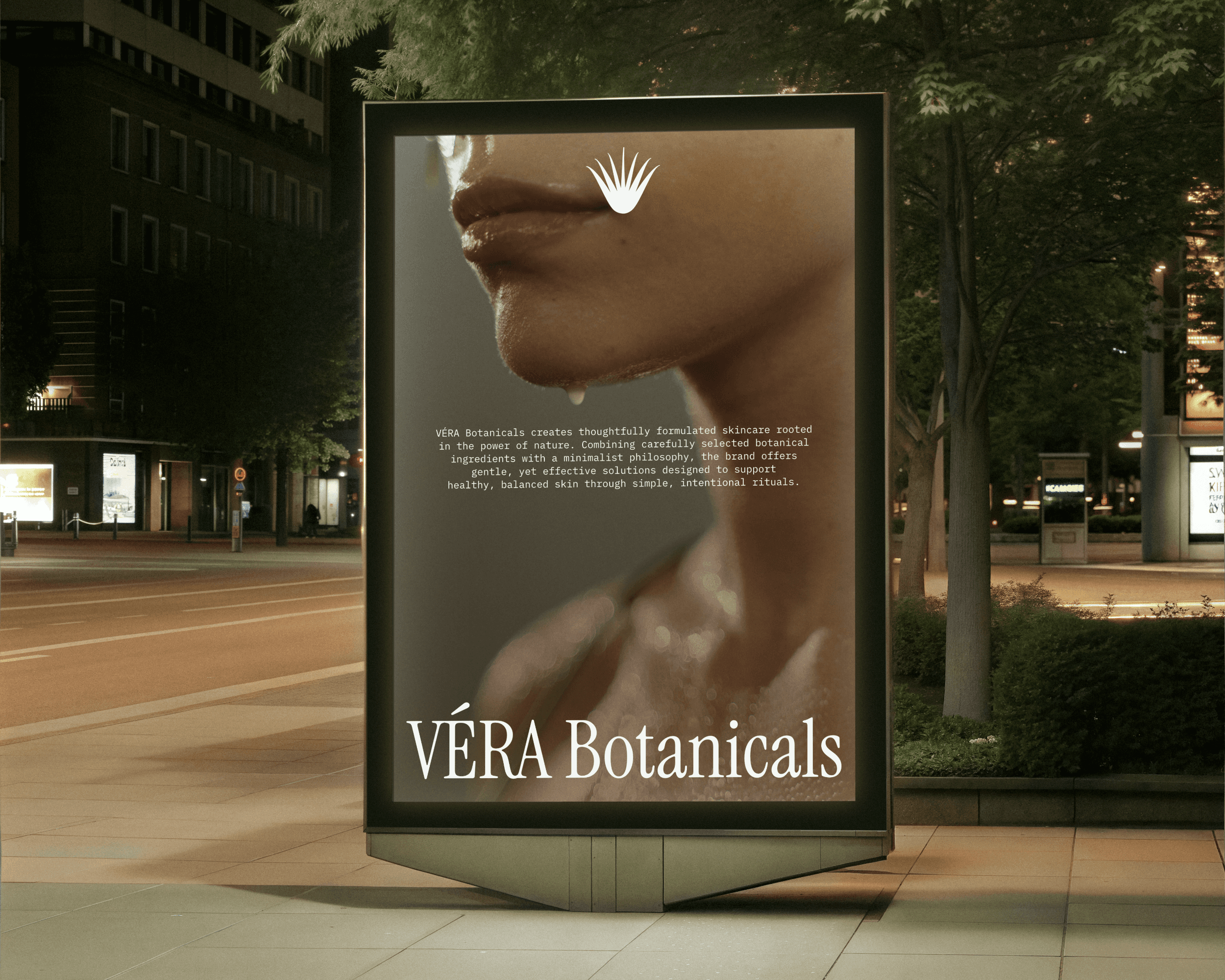
The logo began with an aloe vera plant. It's the brand's core ingredient and is a subtle nod to the brand name.
The final mark is a minimalist illustration of an aloe vera plant. I stripped it back until I had only the lines that actually needed to be there, removing every uneccessary fill and decorative flourish.
The mark sits alongside the logotype cleanly and doesn't compete with it. Both the illustration and type are quiet, and together, they create something that feels like a considered whole.
COLOR & TYPOGRAPHY
The colour decisions came quickly once I understood the brand's emotional territory. The brand needed colours that felt organic rather than manufactured.
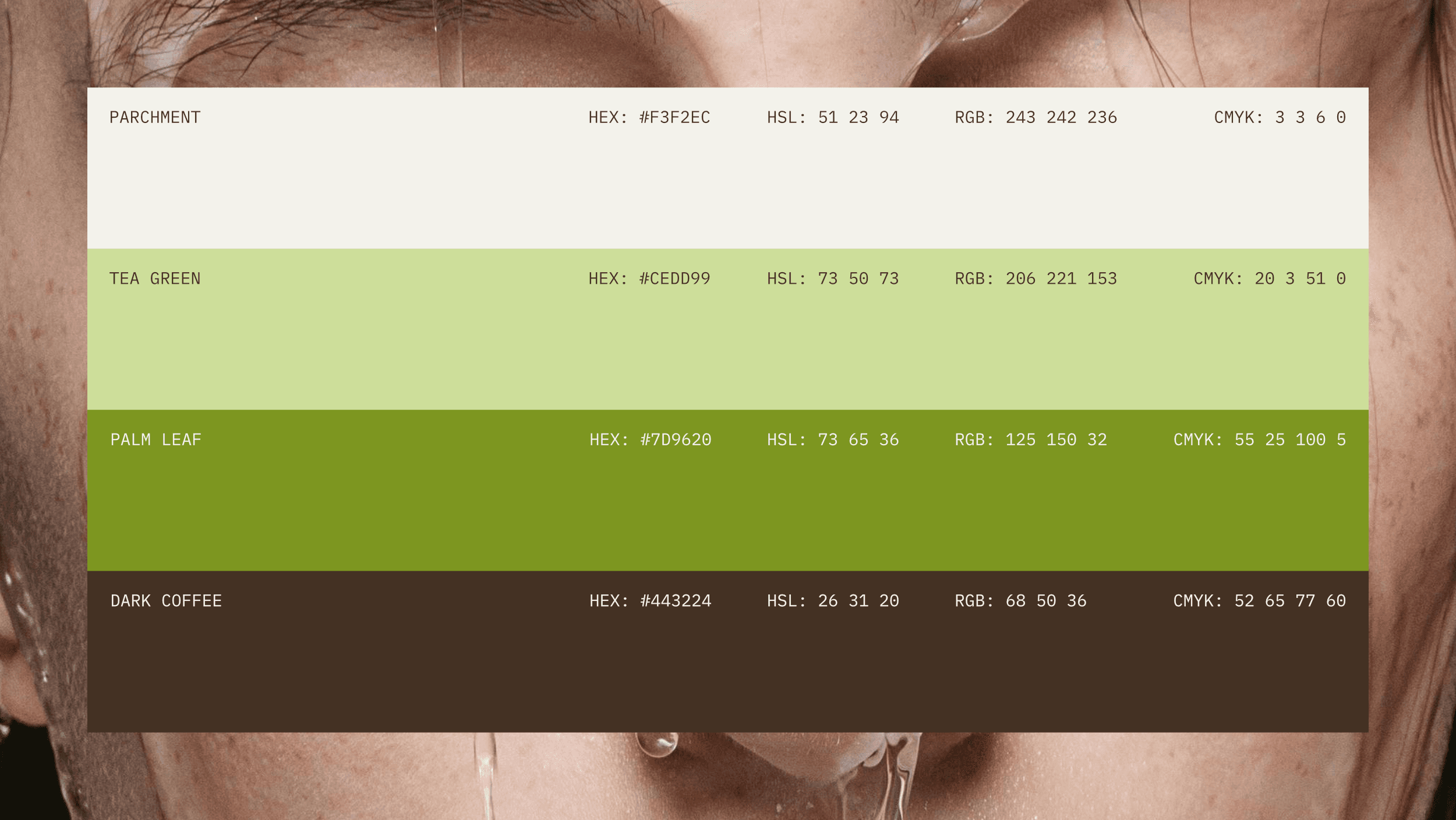
The final palette incorporated shades of cream, earthy greens, and browns. A warm off-white offers a beige-toned base that functions as the dominant ground across all touchpoints. It reads almost like unbleached paper or raw linen. Shades of green ranging from a muted sage to a deeper, more botanical forest tone add character and a pop of color while maintaining the organic feel. Shades of brown were also incorporated to add an earthy, rooted feel reminiscent of bark and soil. The brown adds depth without adding too much weight and contrast.
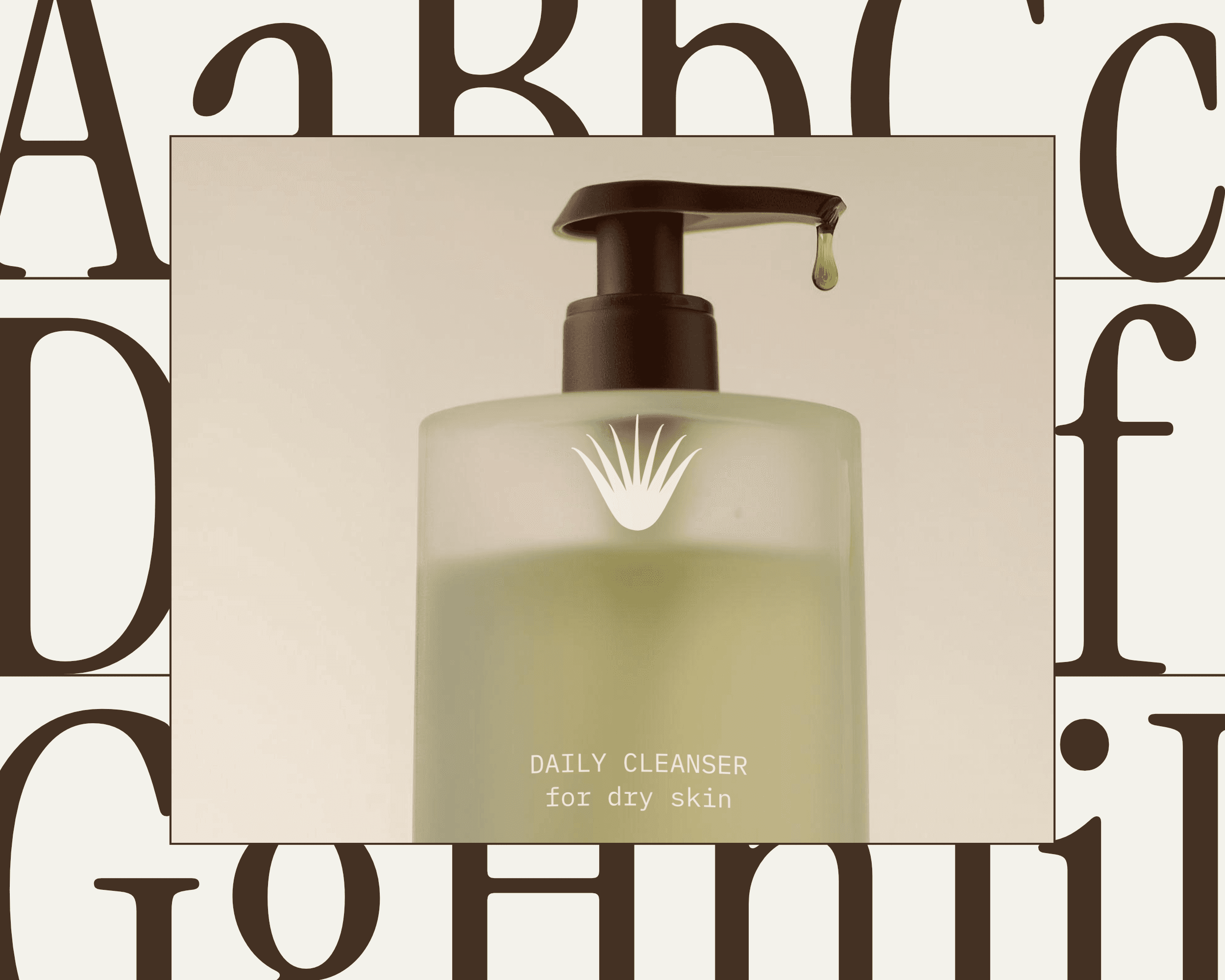
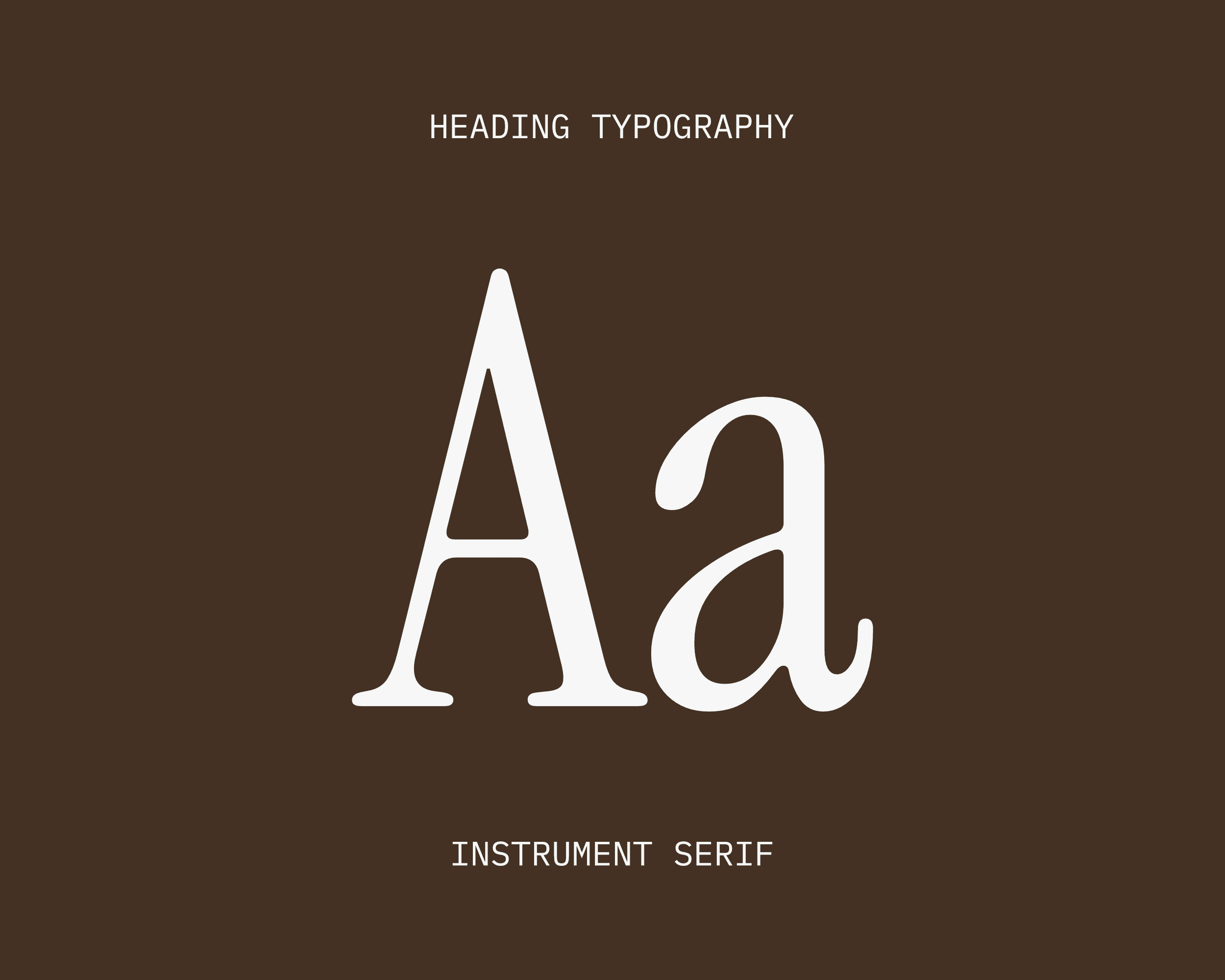
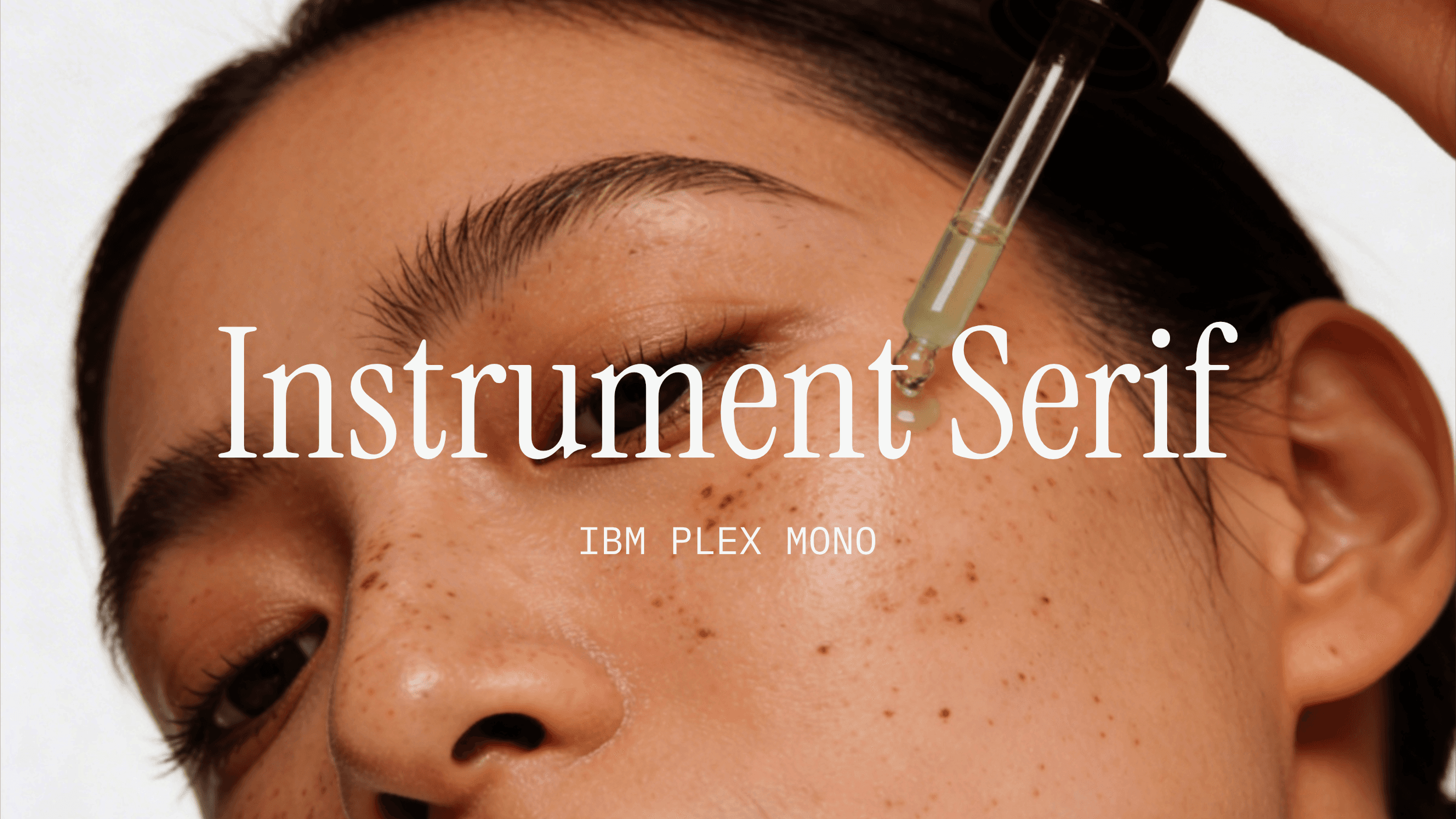
For a brand built on restraint, type does an enormous amount of the communicating. Instrument Serif was used for display use and features in the logo, main headings, and key packaging moments. It's a condensed serif with an editorial confidence to it. It has enough weight to anchor a composition, but isn't decorative for the sake of it. There's no unnecessary flair in the letterforms, which made it feel deeply aligned with the brand's values.
IBM Plex Mono is used for body copy. This typeface brings a kind of quiet precision to the body text. It reads as technical without being clinical.
PACKAGING
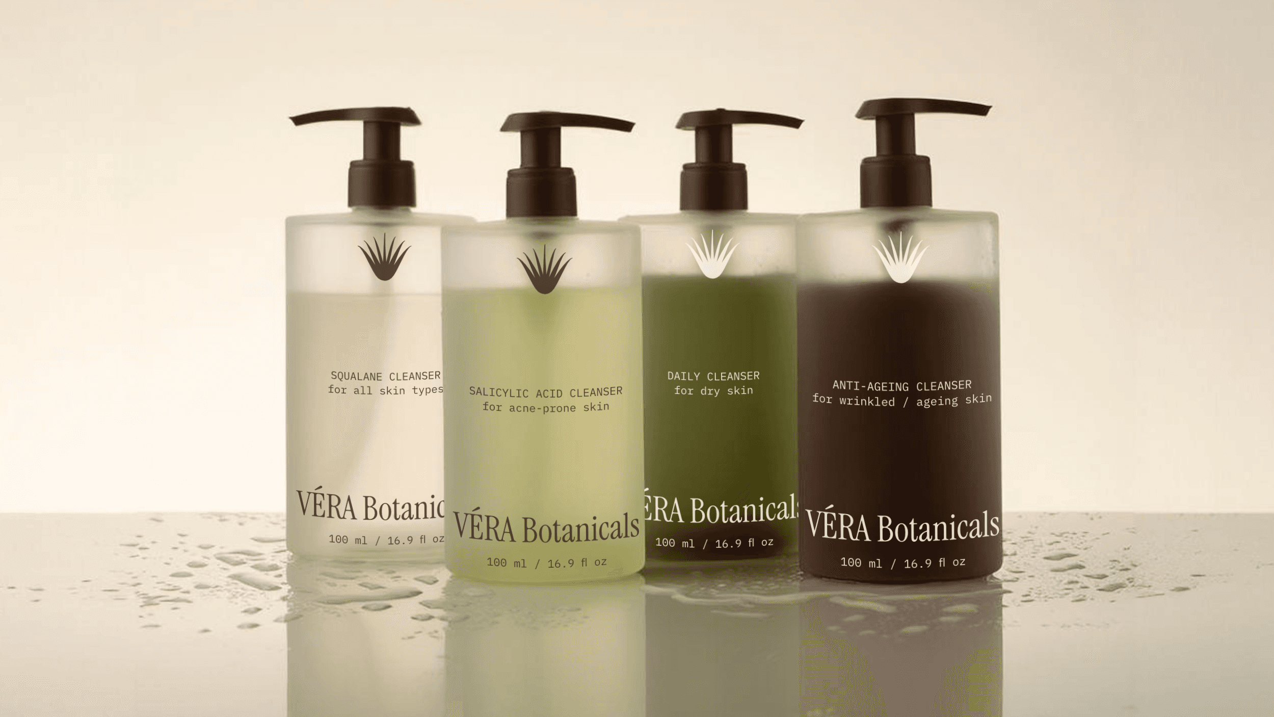
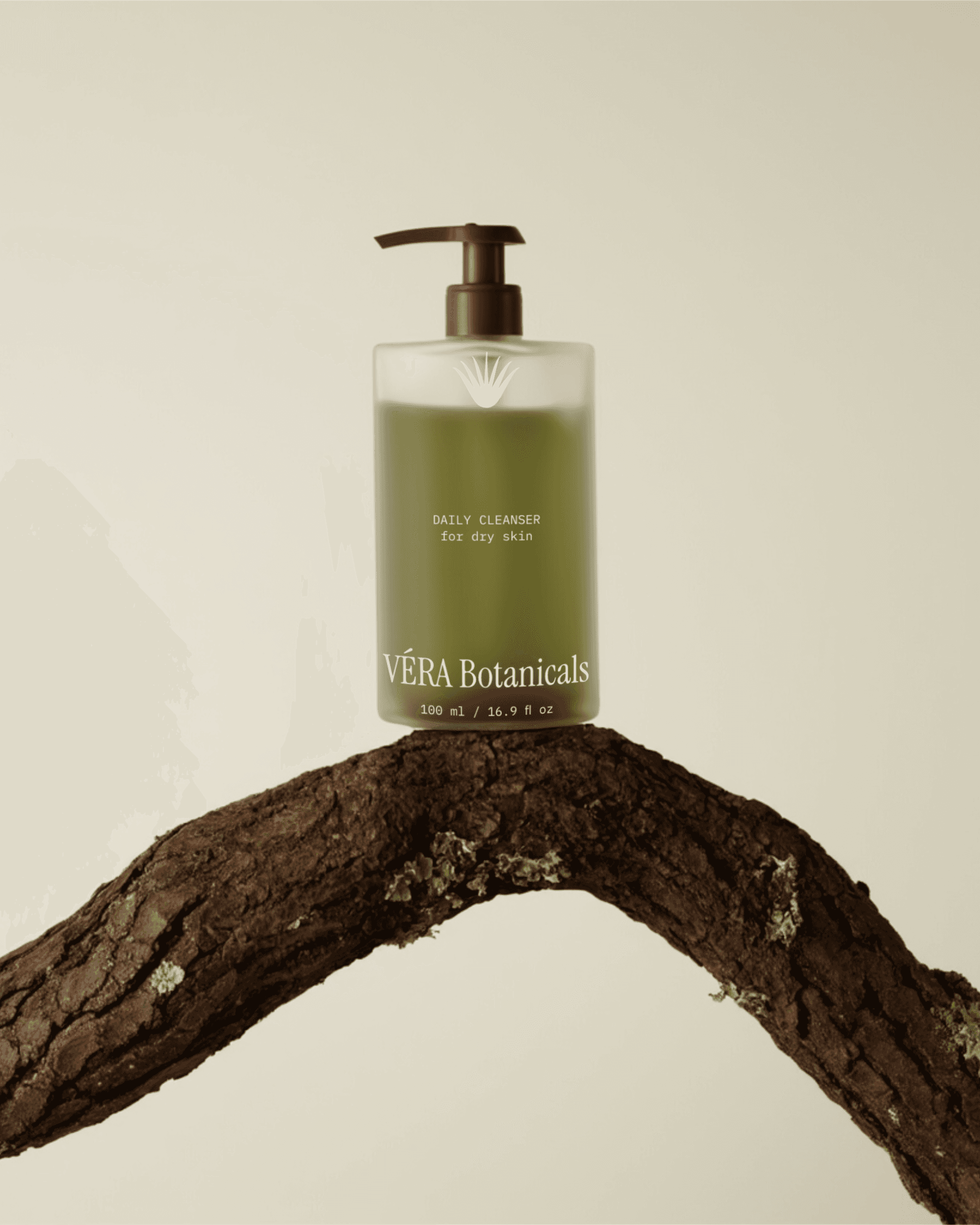
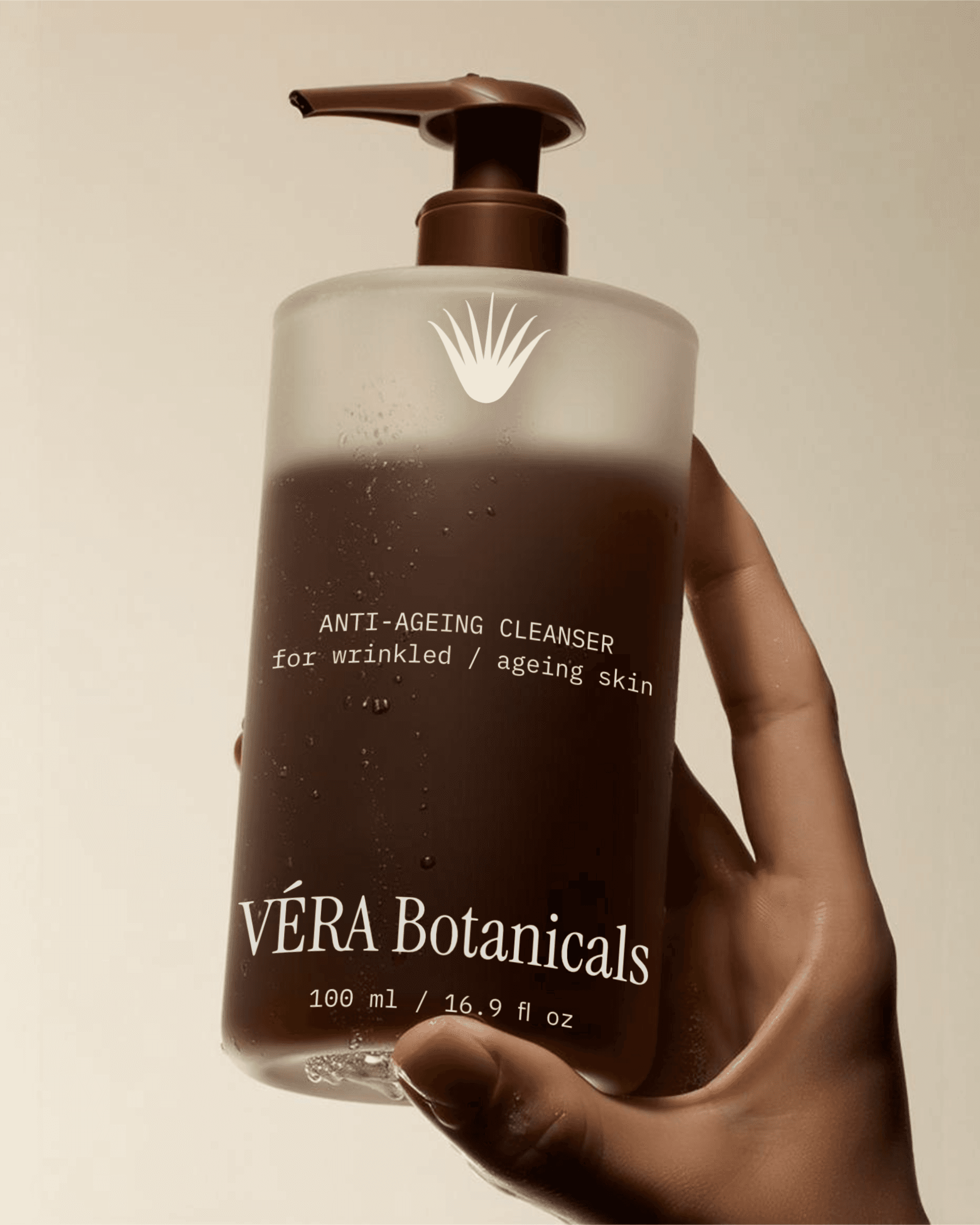
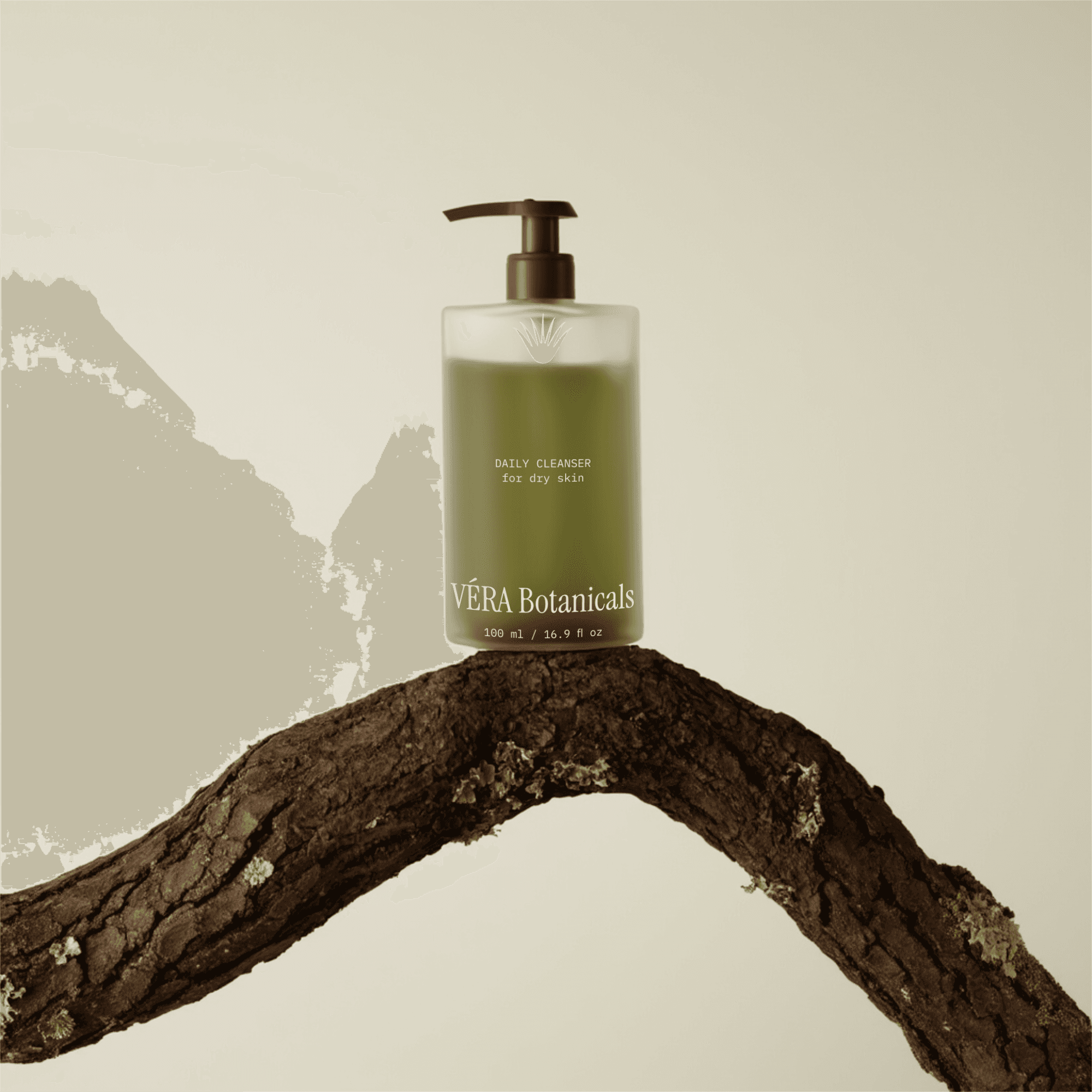
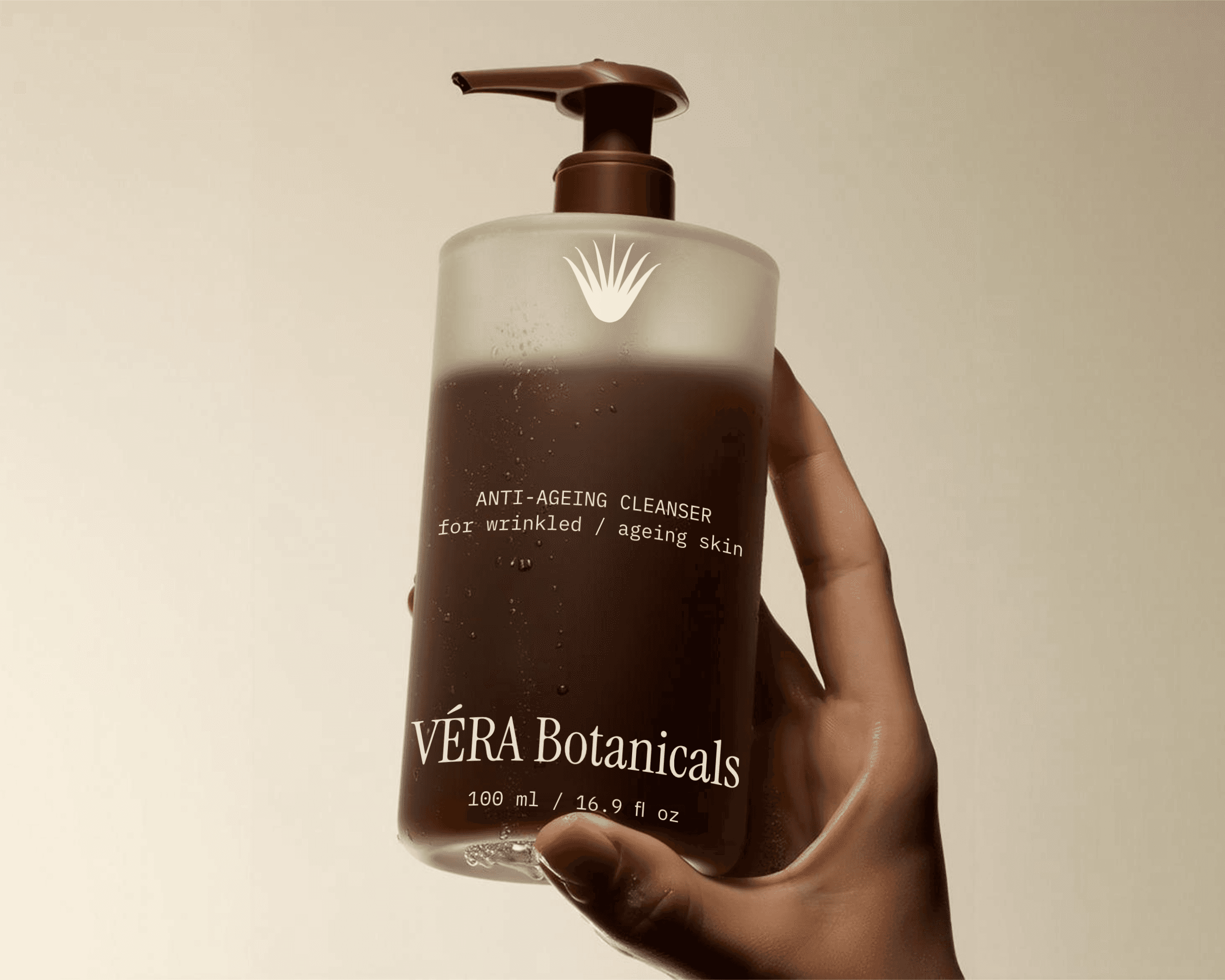
For the packaging design, the logo, type, and palette all had to work together in a real physical context.
The aim was to create packaging that felt restrained and elegant, but also simple and organic. My guiding principle throughout was this: if something can be removed, remove it. Every element that wasn't doing communicative work was drawing attention away from the important bits. The layouts are intentionally spacious. Type is set with careful attention to line length and leading, and the logo appears with enough space around it to breathe.
HOW IT ALL CAME TOGETHER
At the end of this project, we were left with a cohesive brand that feels fresh, clean, and organic. Everything agrees — from the clean layouts to the organic colors and the controlled weight of the typography.
The brand feels quiet in a good way. VÉRA Botanicals is a brand built on the belief that real care doesn't need to be loud.