CASE STUDY:
AURELIA HAIRCARE




SCROLL
PROJECT DETAILS
Aurelia Haircare is a premium haircare brand focused on restoring hair health through simplified routines and high-performance formulations.
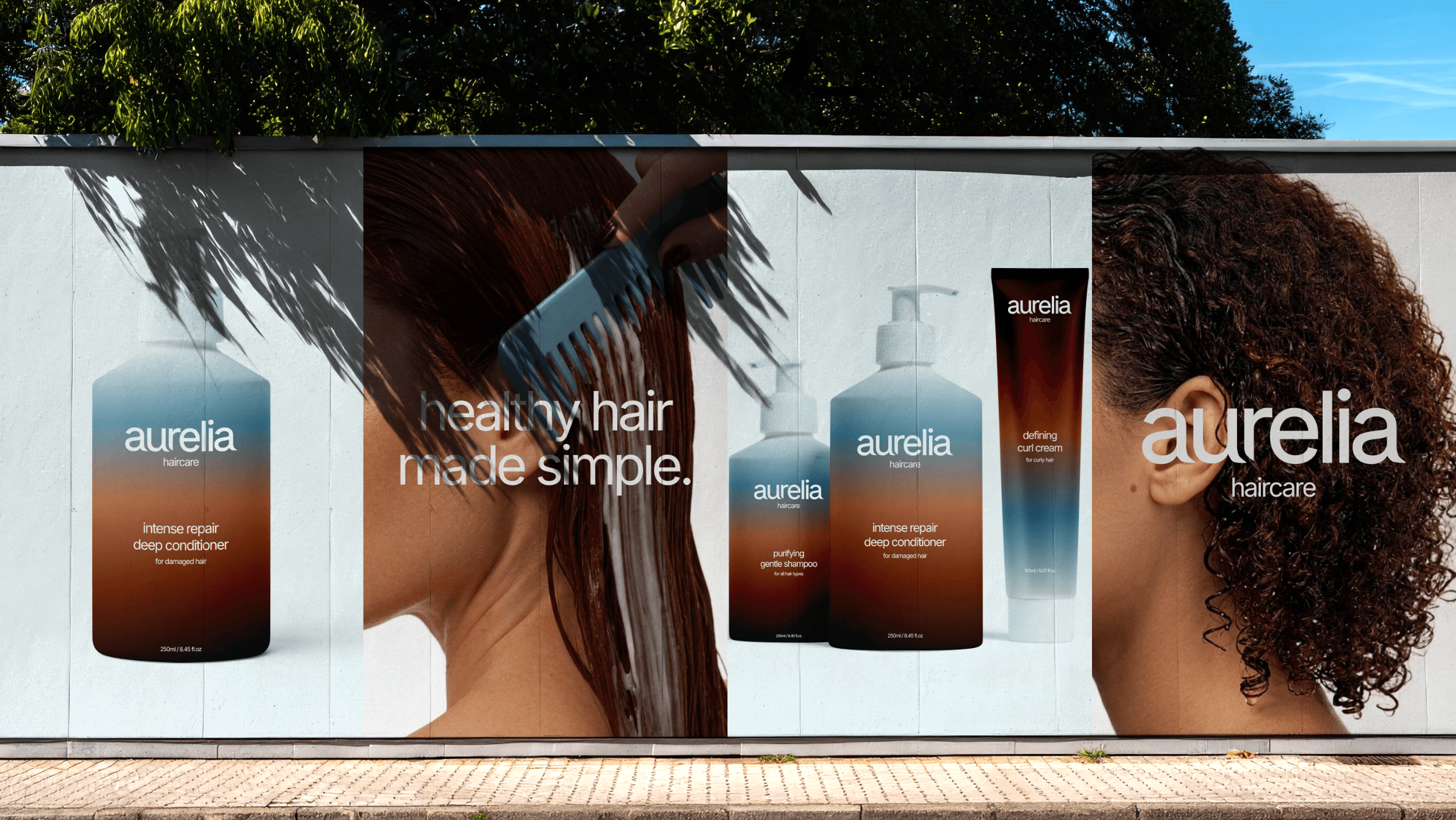
The project involved designing a brand identity and designing a collection of packaging with a modern and minimal aesthetic.
The visual language features clean typography, improved spacing systems, and a calm colour palette that elevates the brand's perceived value.
INDUSTRY
Beauty (Haircare)
YEAR
2026
SERVICES
Branding & Packaging Design
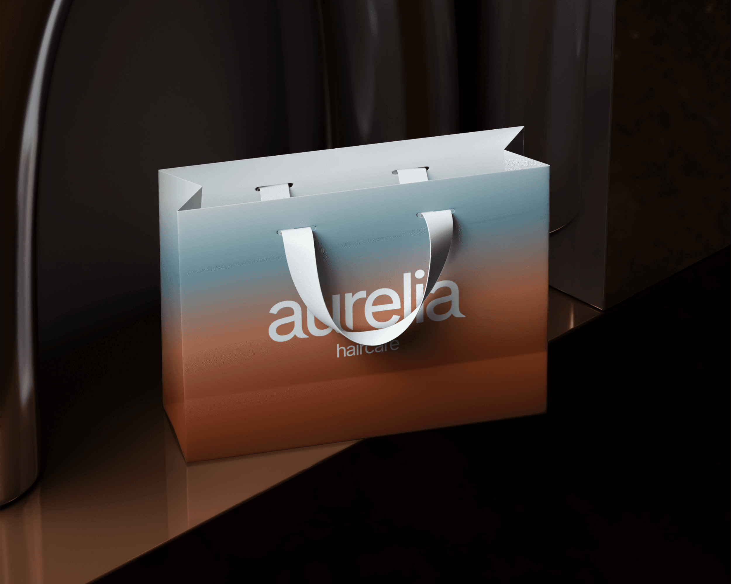
THE BRIEF
Aurelia Haircare is a premium haircare brand centered on restoring hair health through simplified routines and high-performance formulations.
From the start, the goal was to design something that felt calm and considered — a brand identity and packaging collection with a modern, minimal aesthetic that reflects the same philosophy as the products themselves.
THE LOGO
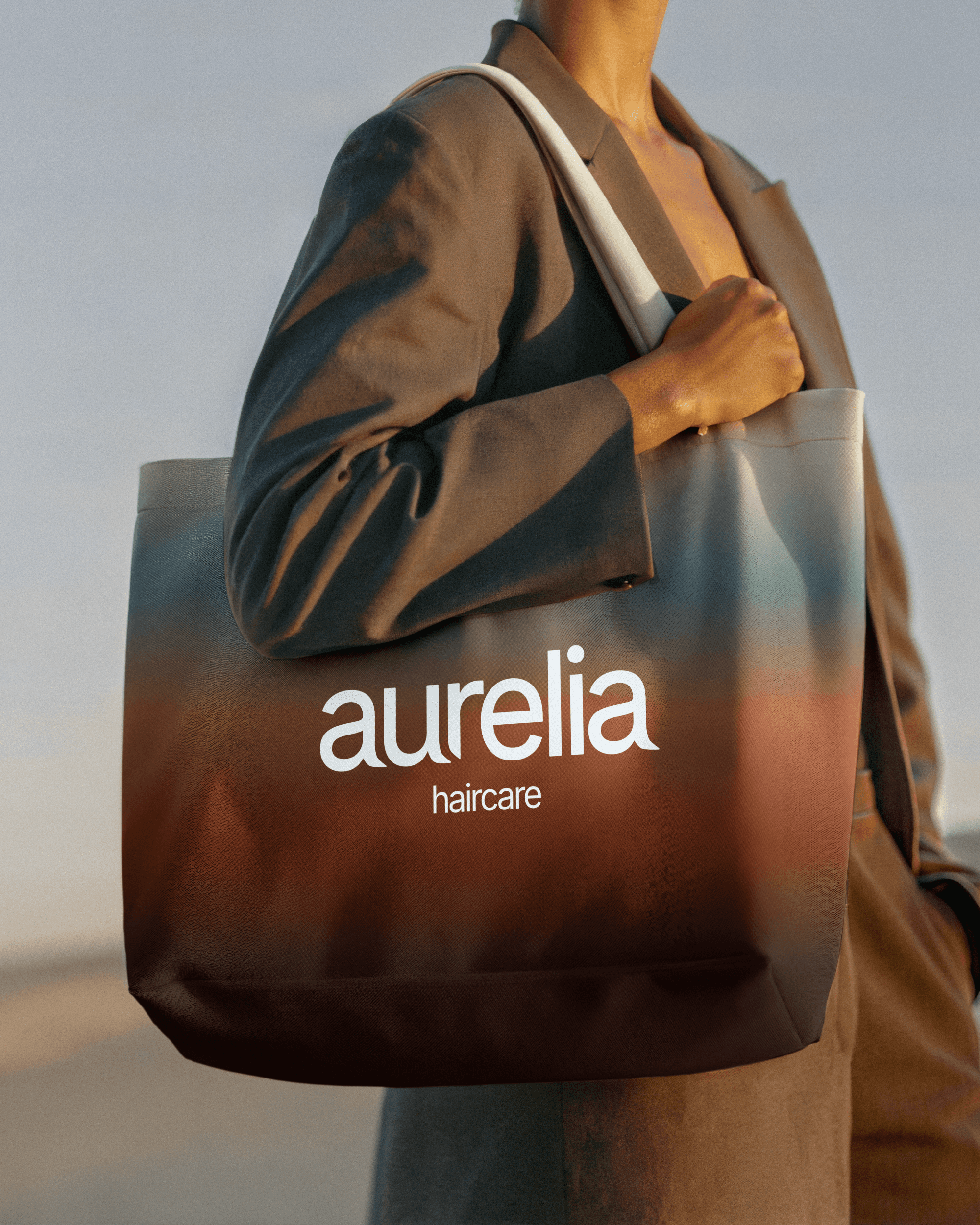
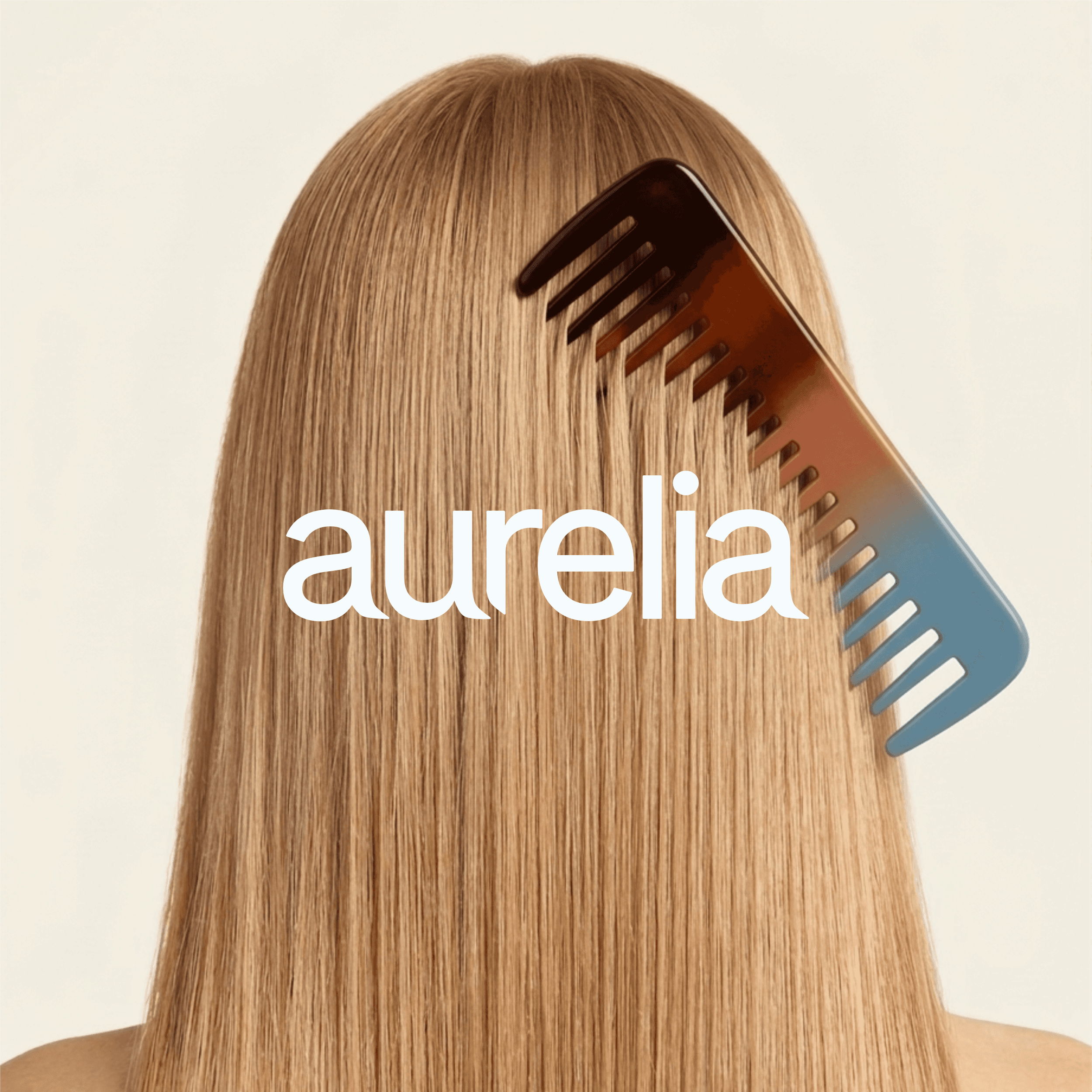
The logo design is a simple typography-based mark that features the brand name in a simple sans serif, with some subtle type customizations on some of the letters. The logo is versatile, clean, and simple, and it fits perfectly into Aurelia's world.
COLOR & TYPOGRAPHY
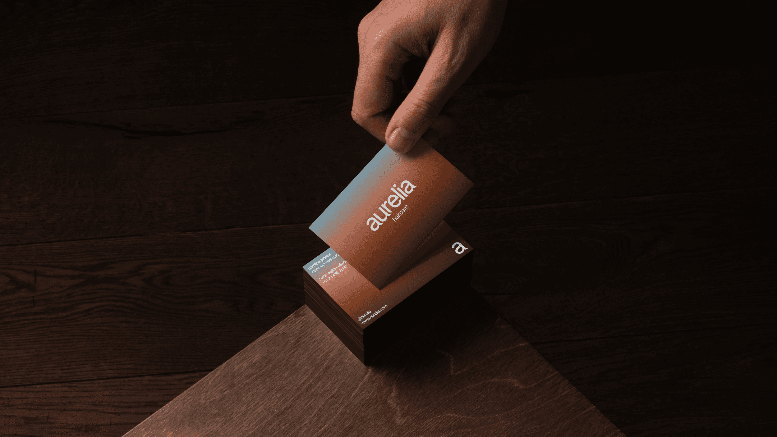
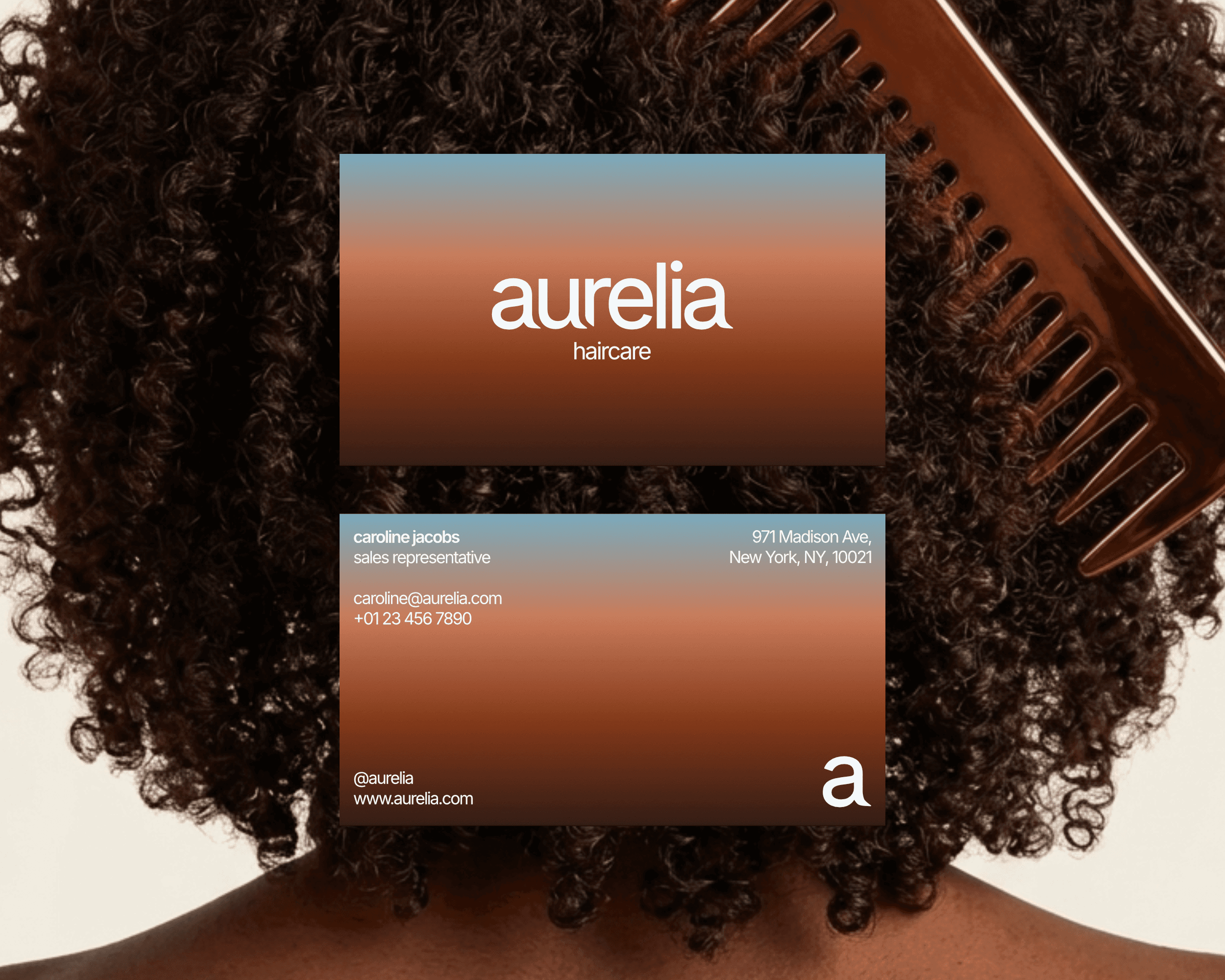
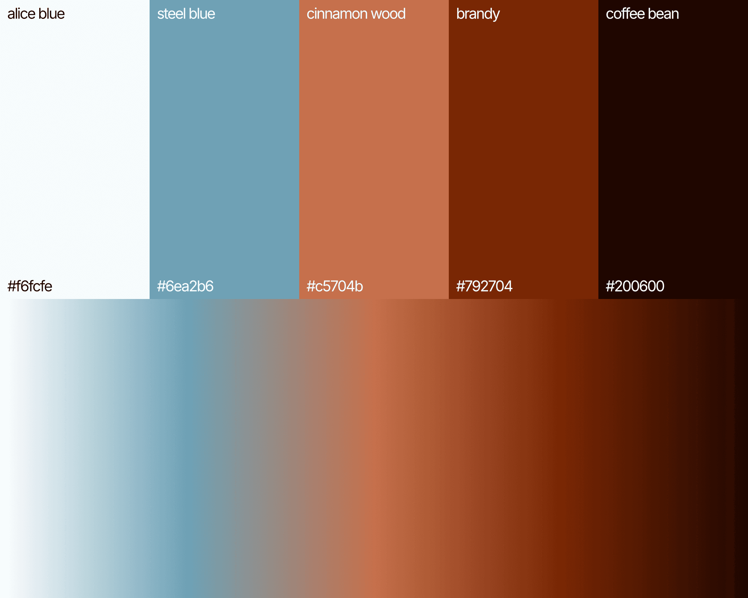
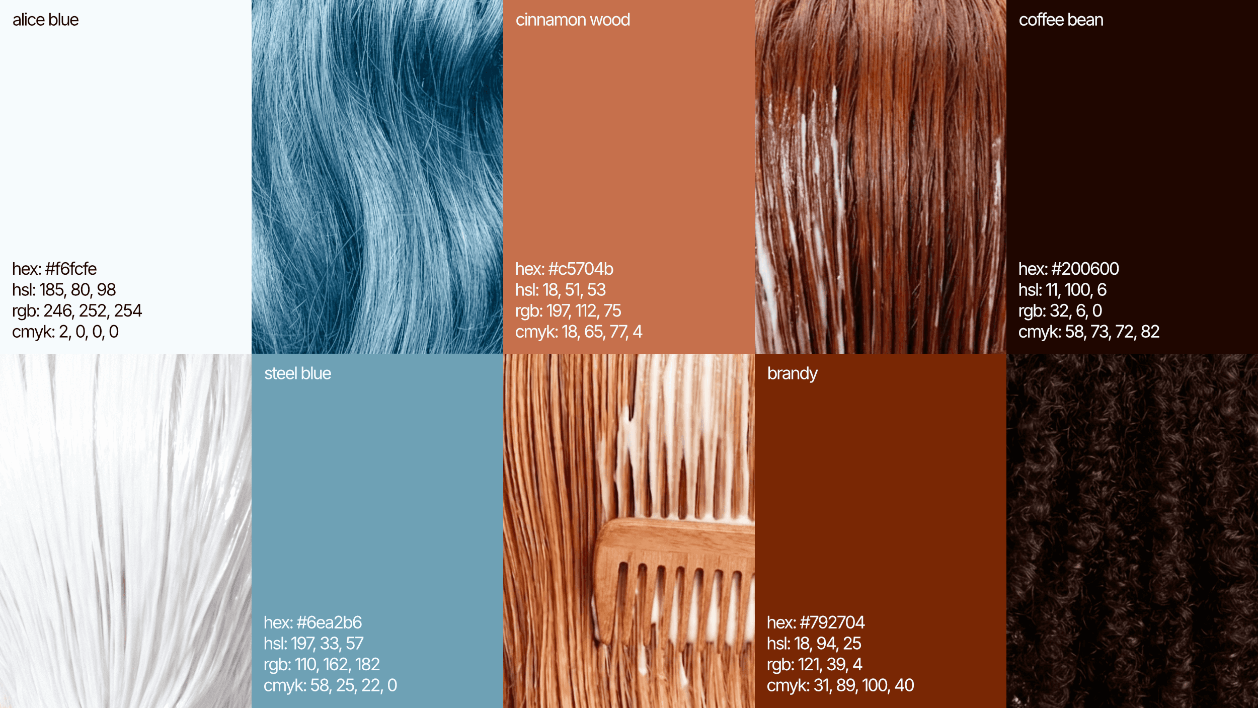
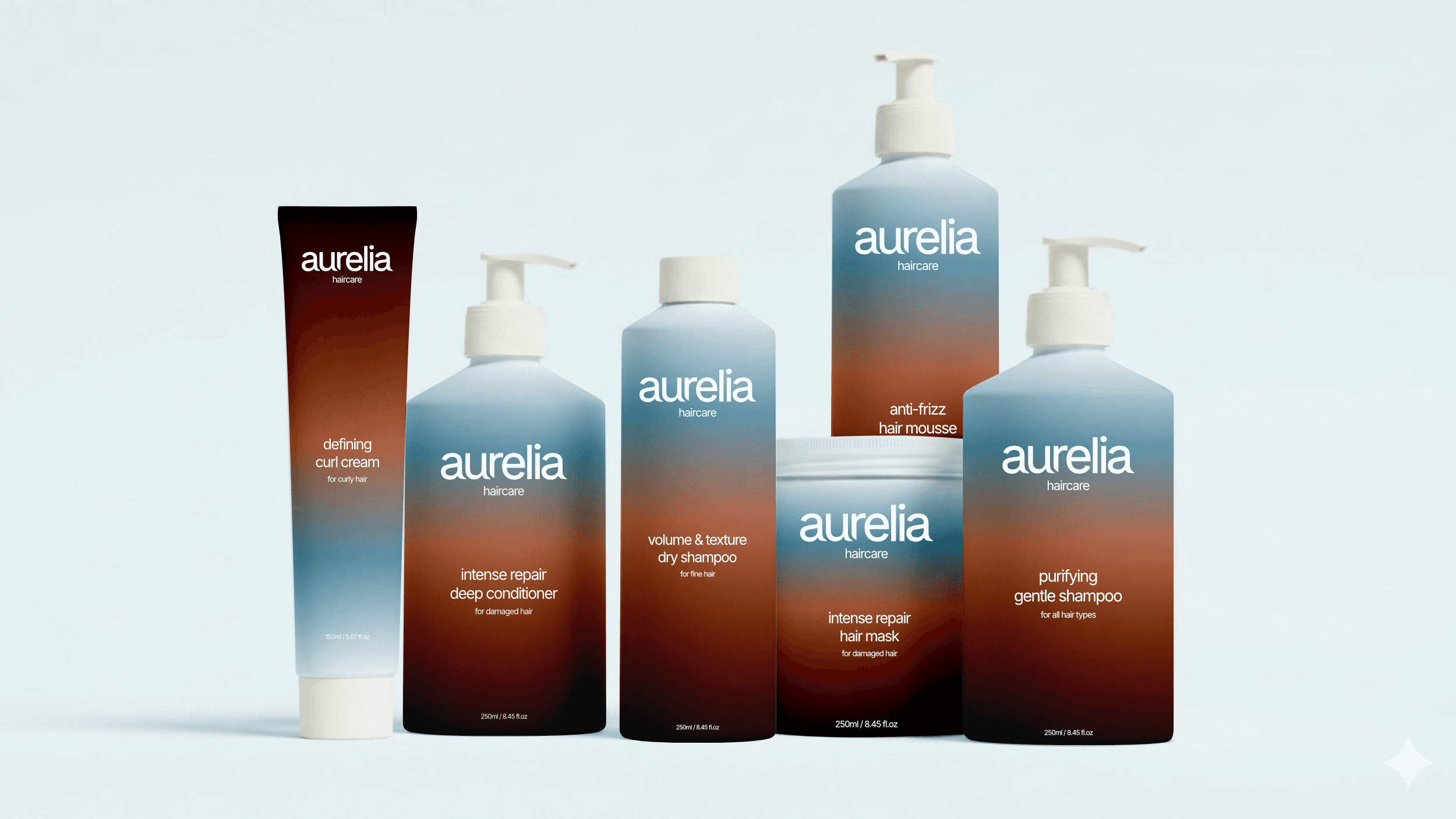
The color palette was designed to feel calm and cohesive, yet distinct. Every shade can sit alongside the others without competition and the entire palette was built as a family. The shades of brown and auburn are a subtle celebration of the various different shades of natural hair. The soft blue complements the warmer tones, creating a more well-rounded, grounded palette.
The identity is built on Inter. Inter carries a certain clarity and precision that sits well within a brand that is designed to feel calm and considered.
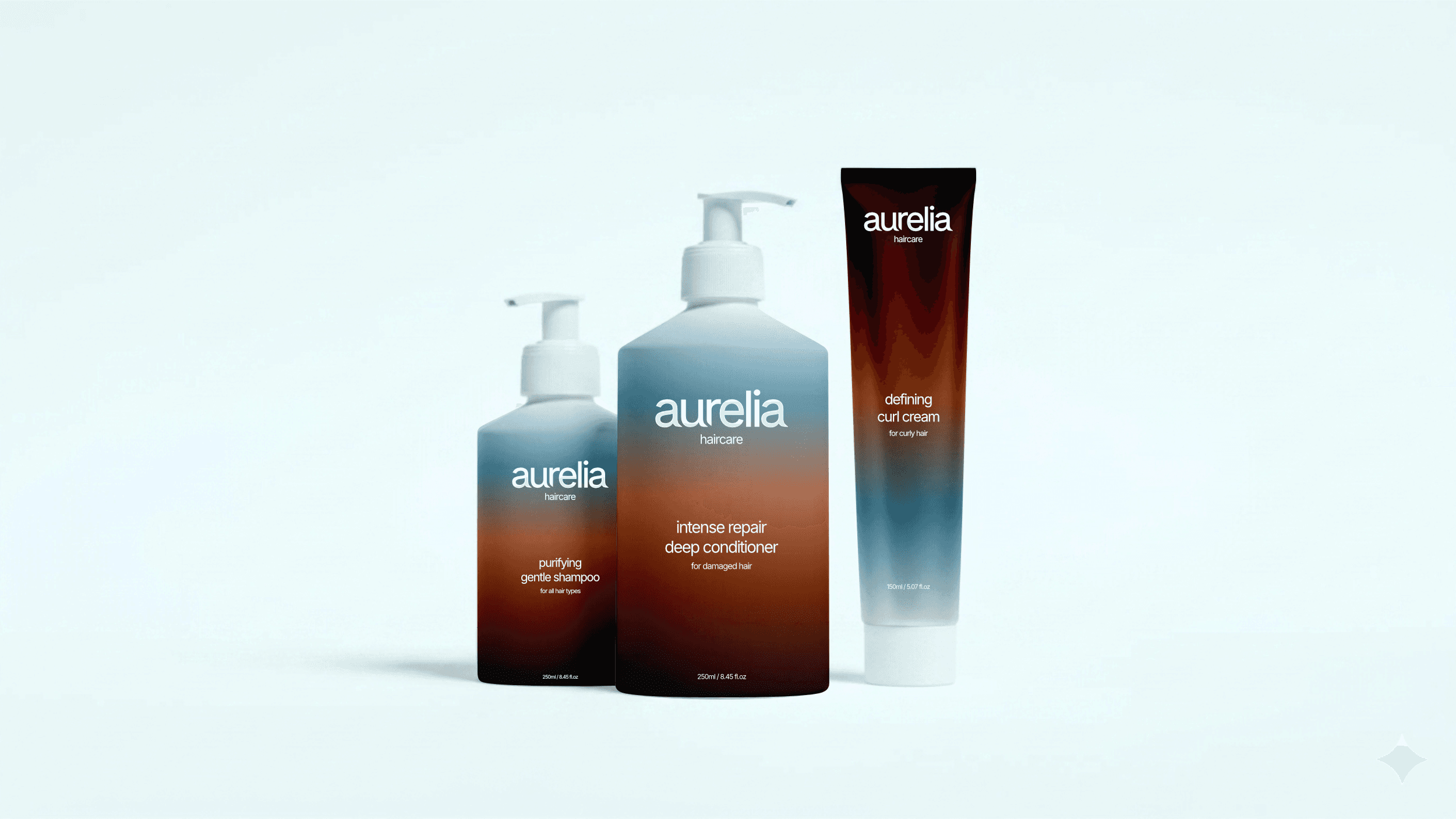
PACKAGING DESIGN
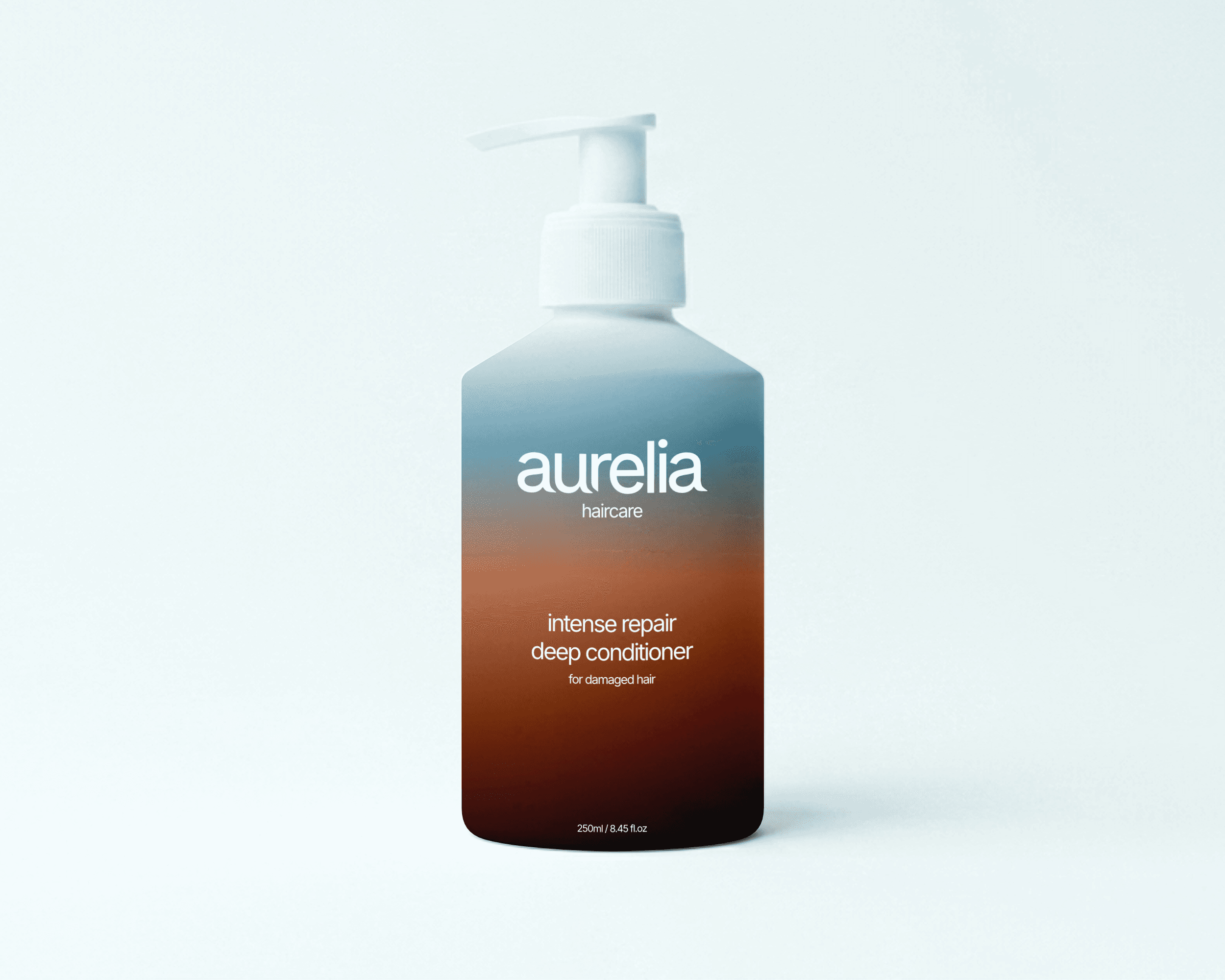
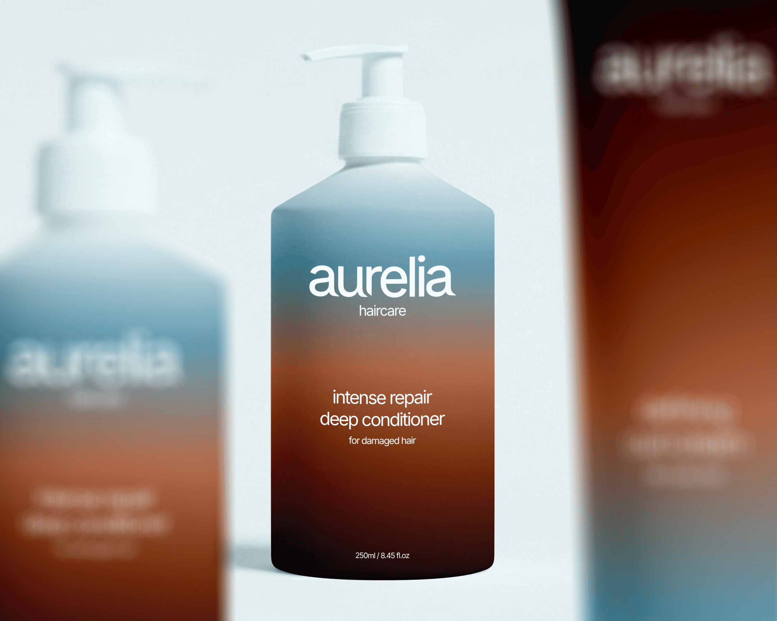
The packaging design is really an extension of the identity work, taking everything established in the visual system and translating it into something three-dimensional.
The goal was to create something that you would want to keep on your bathroom shelf instead of hiding it away in a cabinet. Every decision on the packaging comes back to that shelf moment. The text hierarchy free from clutter and the white space does the heavy lifting. The color palette moves across the range in a way that differentiates the products and makes Aurelia's range instantly recognizable.
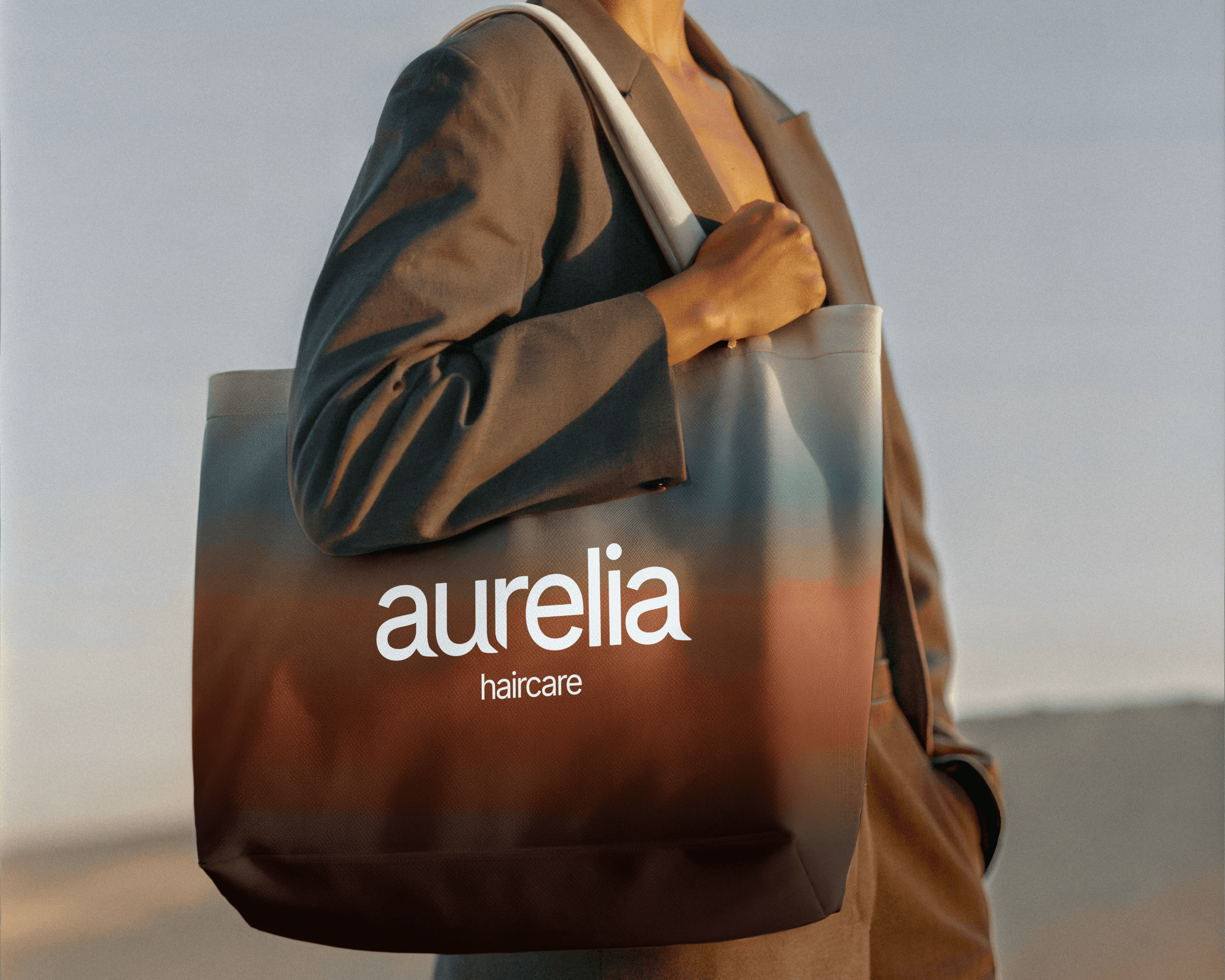
THE FINAL IDENTITY
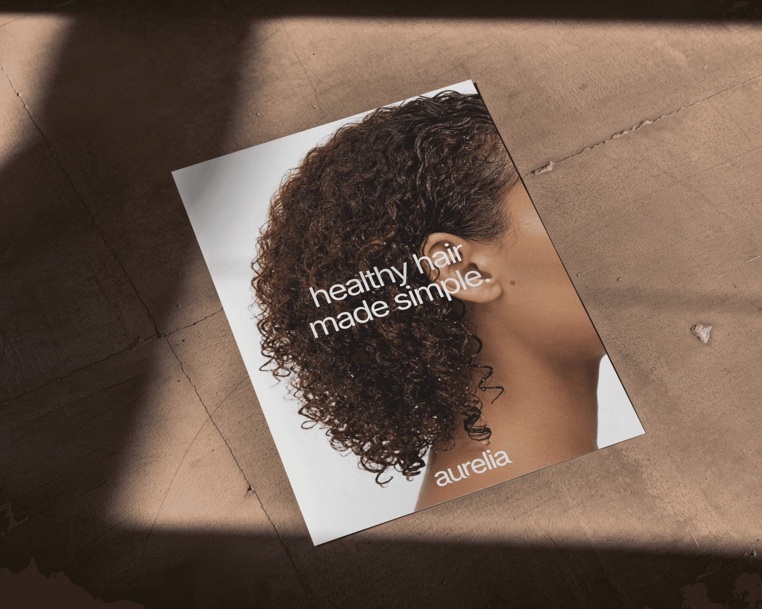
At the end of the project we were left with an identity that feels distinct, cohesive, and like an elegant celebration of hair in all its forms. The brand has a voice that is quiet, considered, and consistent, and it held across every touchpoint.