CASE STUDY:
NEXORA SYSTEMS




SCROLL
PROJECT DETAILS
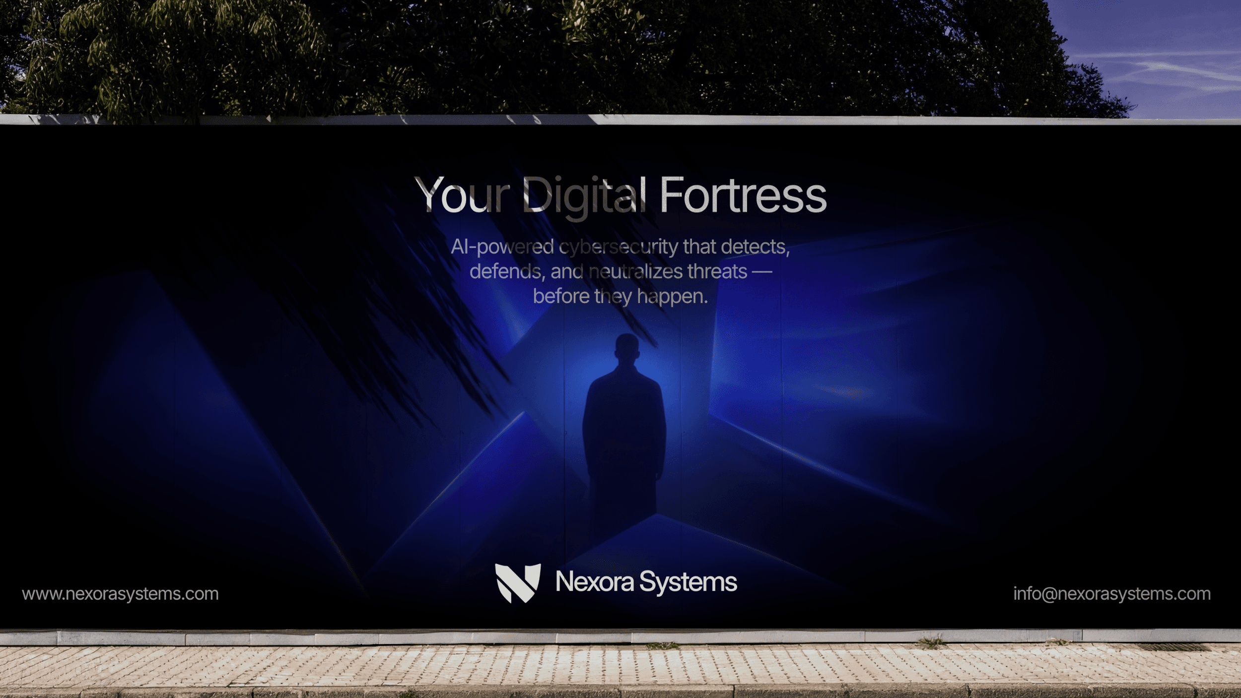
Nexora Systems is an AI-powered cybersecurity brand. For this project, I designed both the visual identity and website, with the goal of communicating innovation, intelligence, and trust — balancing high-tech sophistication with clarity and usability.
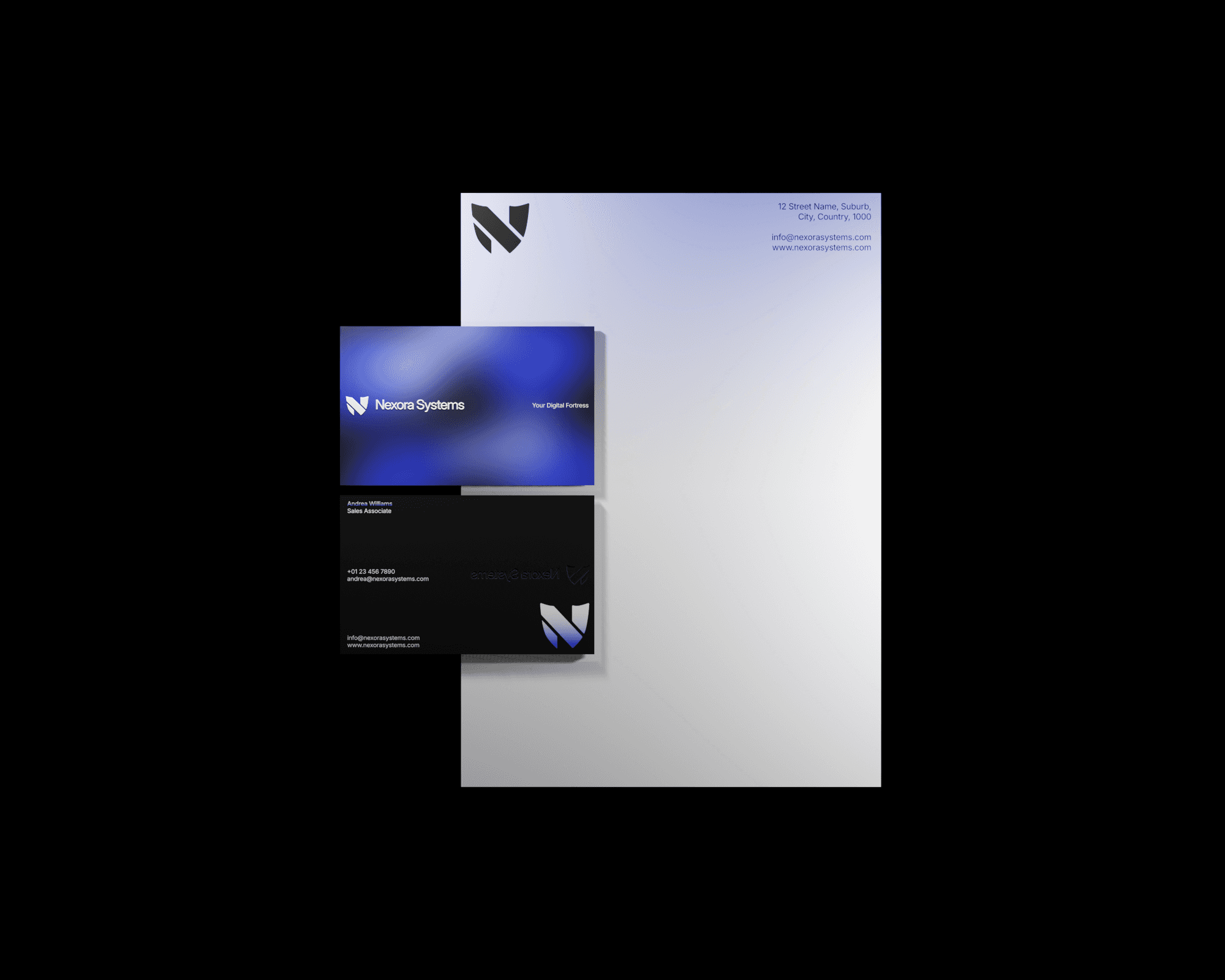
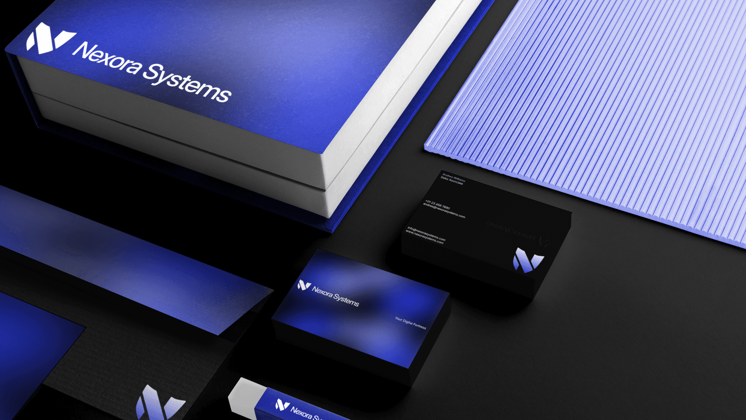
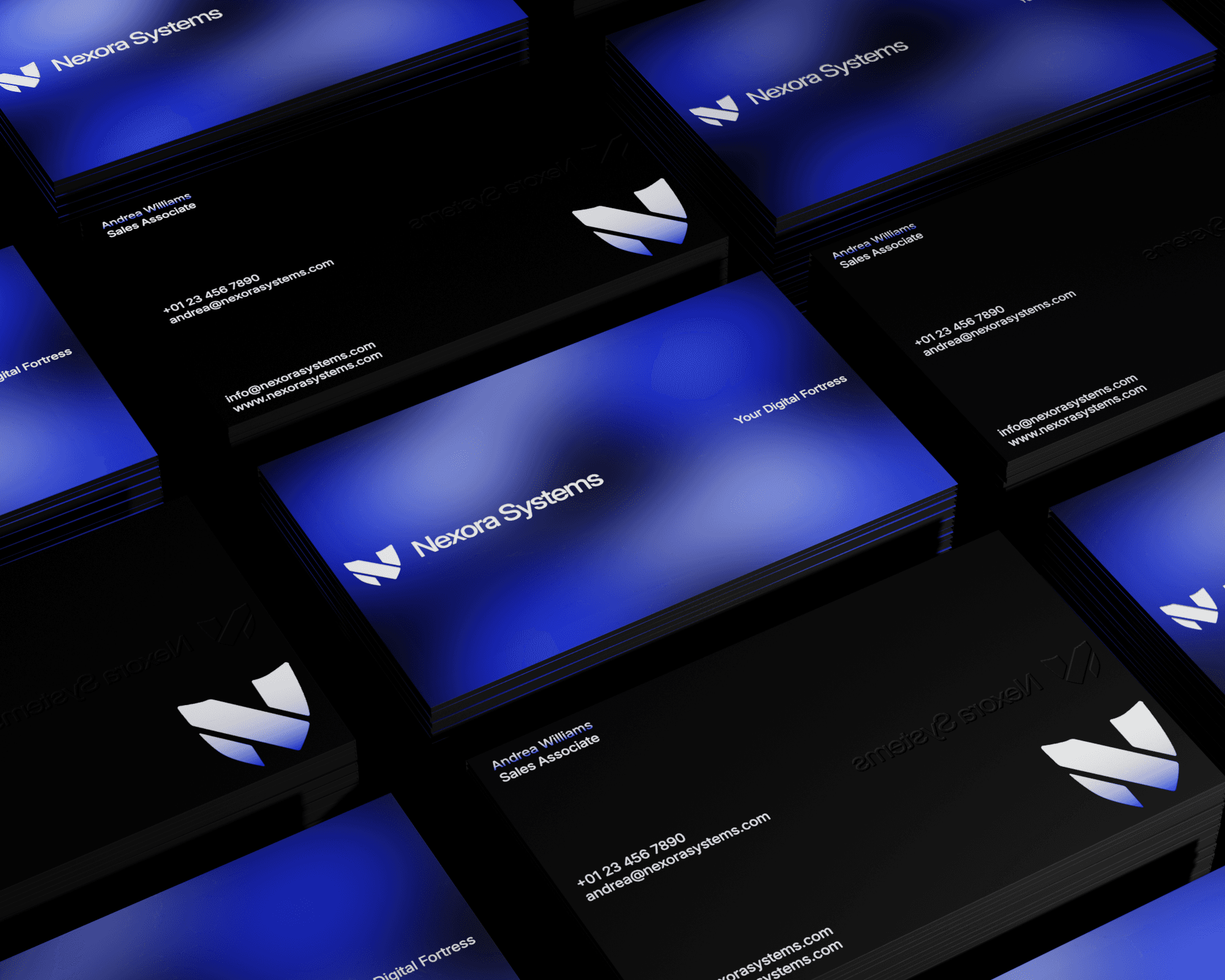
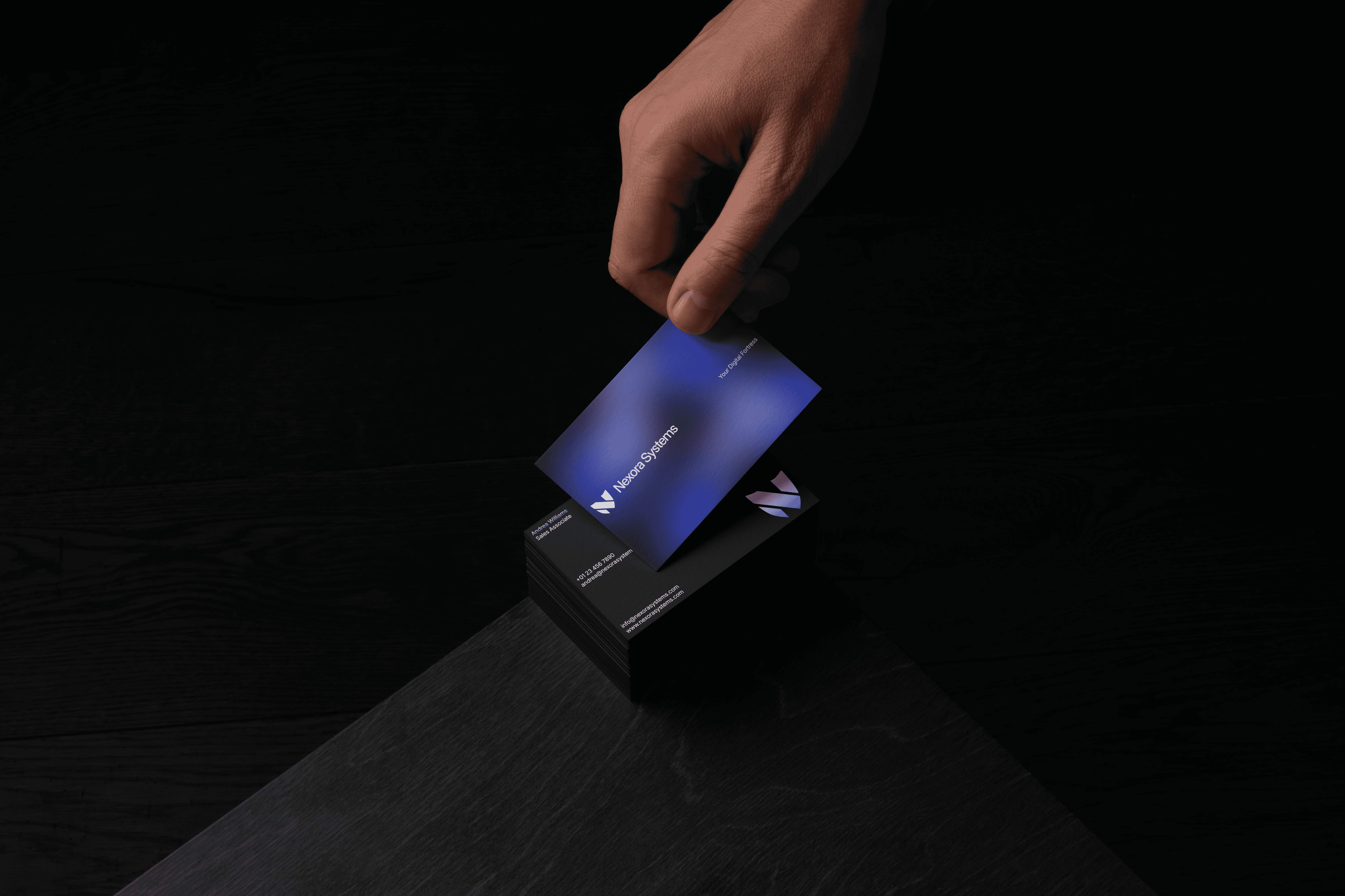
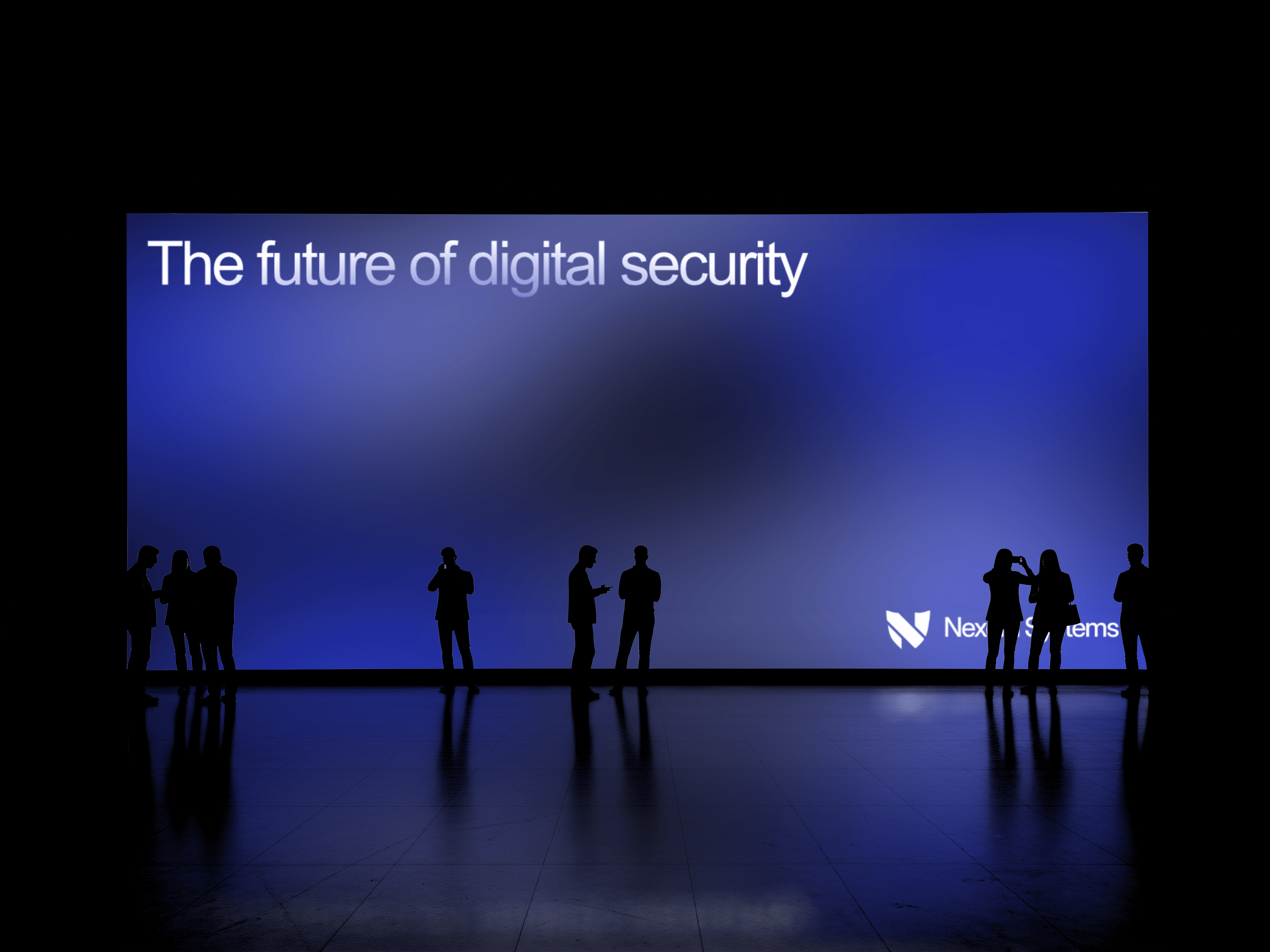
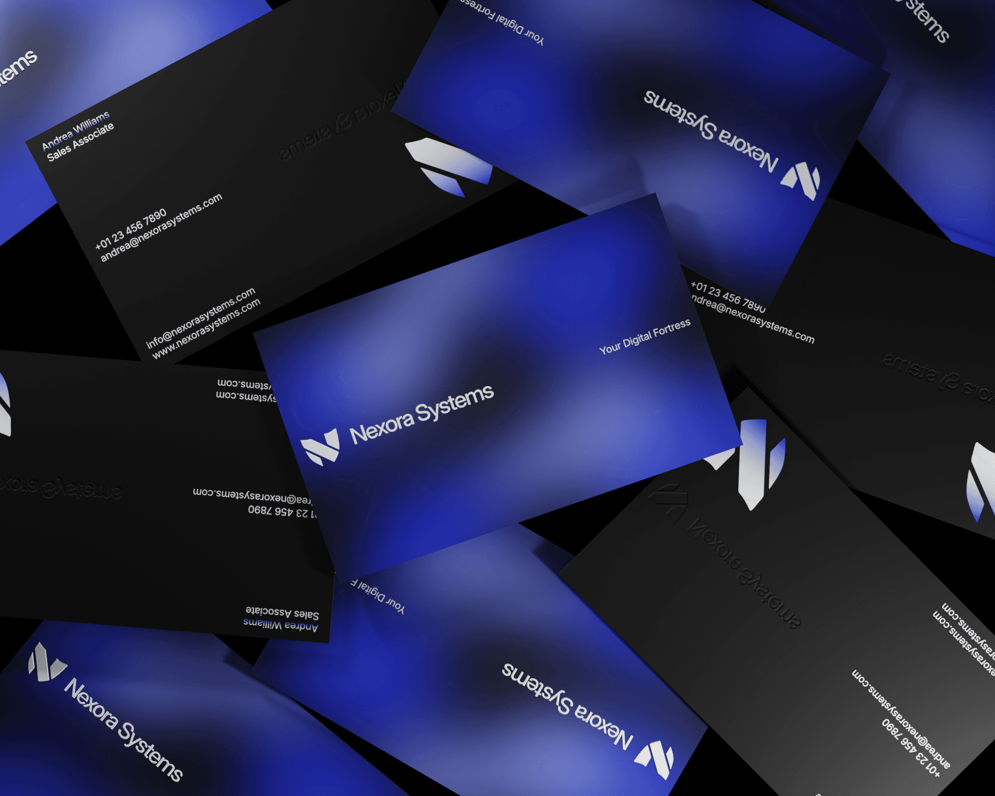
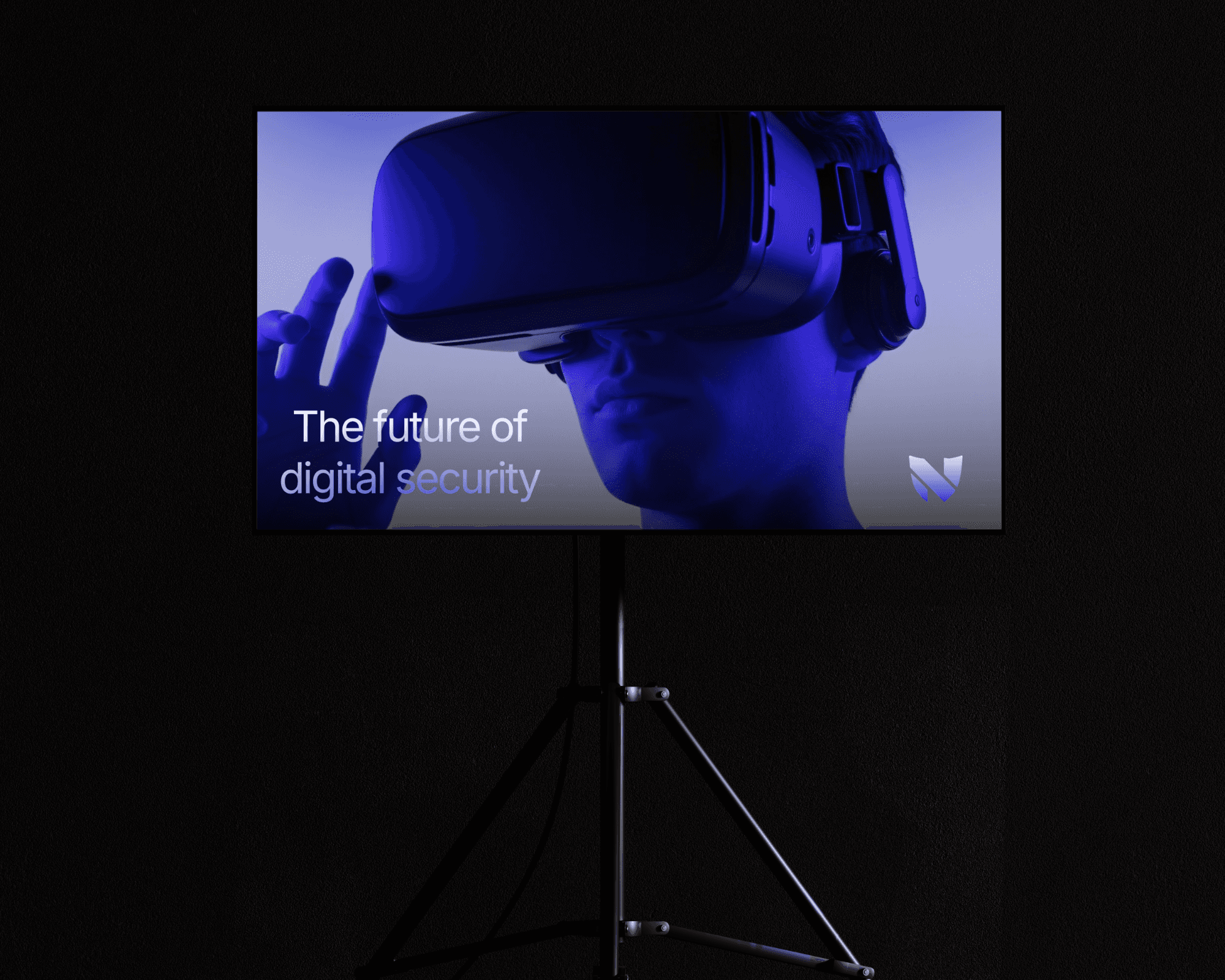
The visual identity draws on modern, tech-forward cues to create a sleek, confident aesthetic. A refined palette of pure white and deep black establishes contrast and structure, while a bold electric blue accent injects energy and highlights key moments across the brand. Inter was chosen as the primary typeface for its clean, modern forms and exceptional legibility, reinforcing Nexora’s precision-driven, future-focused positioning.
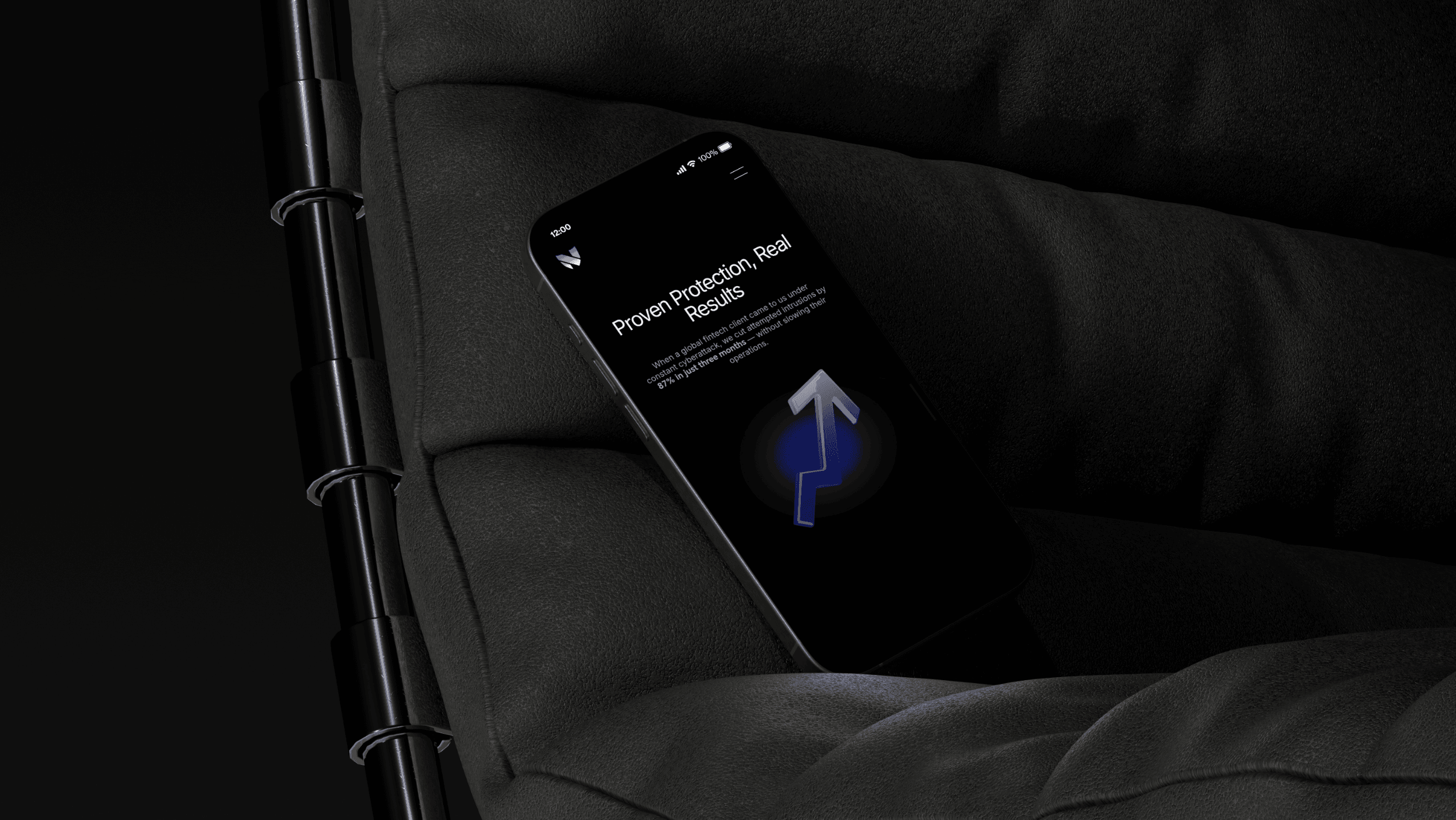
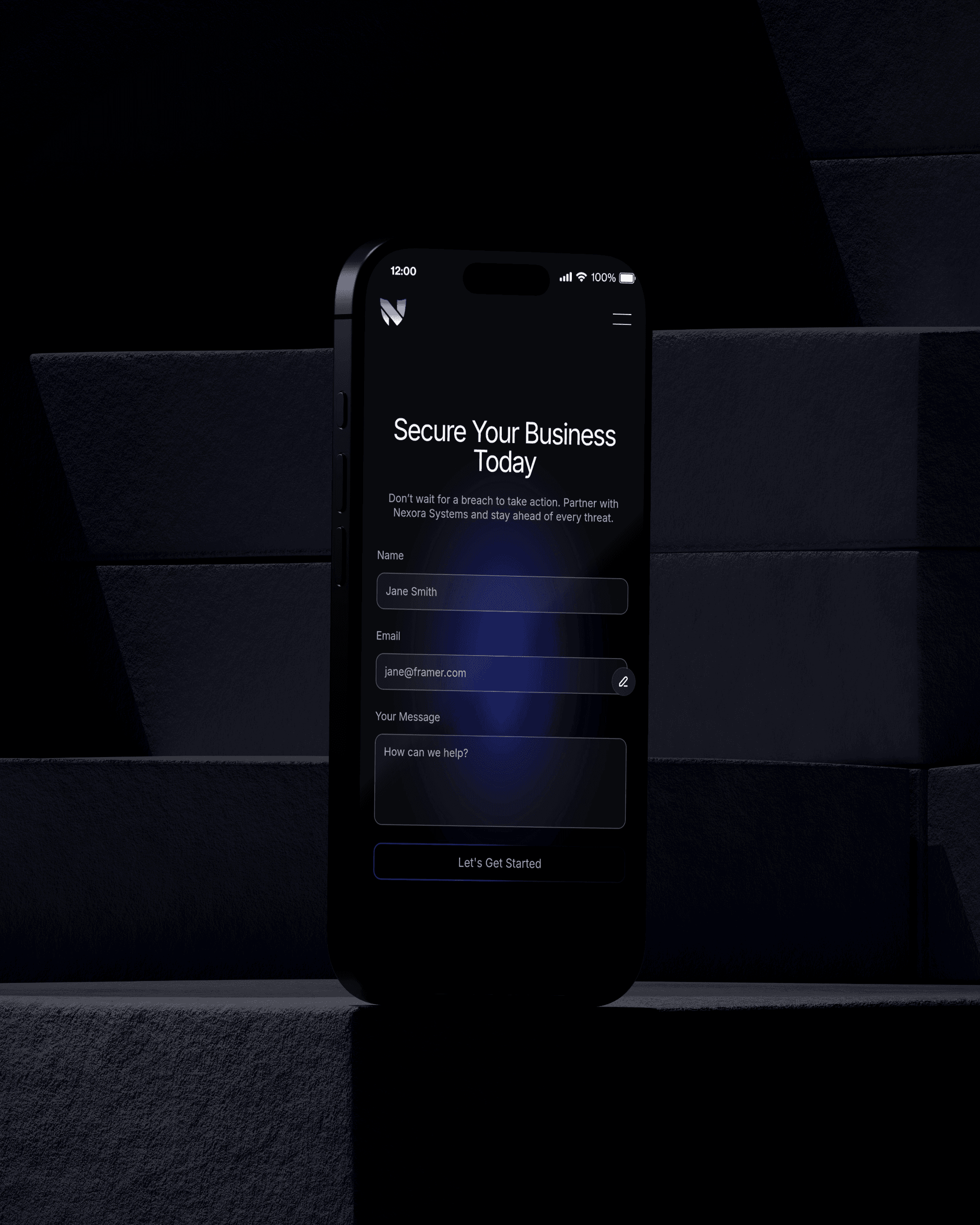
The website was designed and built in Framer as a seamless extension of the brand identity. With performance and responsiveness at its core, the layout is clean, intuitive, and fully optimized across desktop, tablet, and mobile. Subtle animations, scroll-based interactions, and dynamic motion elements guide users through the site, creating a sense of flow and momentum without overwhelming the experience.
To elevate the digital presence further, custom 3D elements were created in Spline, adding depth and interactivity while reinforcing the brand’s advanced, innovative nature. Together, the visual identity and website design form a cohesive, high-impact brand experience — modern, intelligent, and confidently positioned within the tech space.
INDUSTRY
Technology
YEAR
2025
SERVICES
Branding & Web Design



THE BRIEF
Cybersecurity is a space where brands often lack personality. The goal for this project was to design a brand that felt genuinely advanced and tech-forward, but also clear, confident, and trustworthy. The kind of brand that enterprise clients would take seriously, and that end users wouldn't find intimidating.
THE LOGO
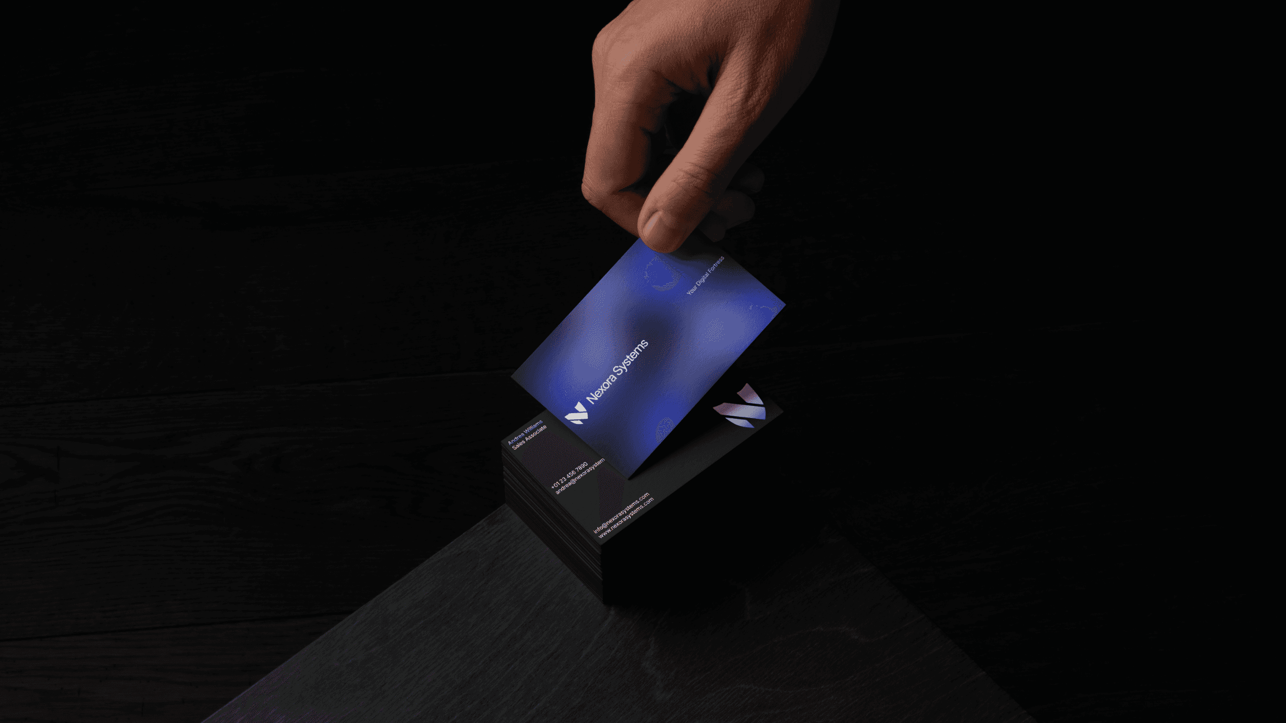
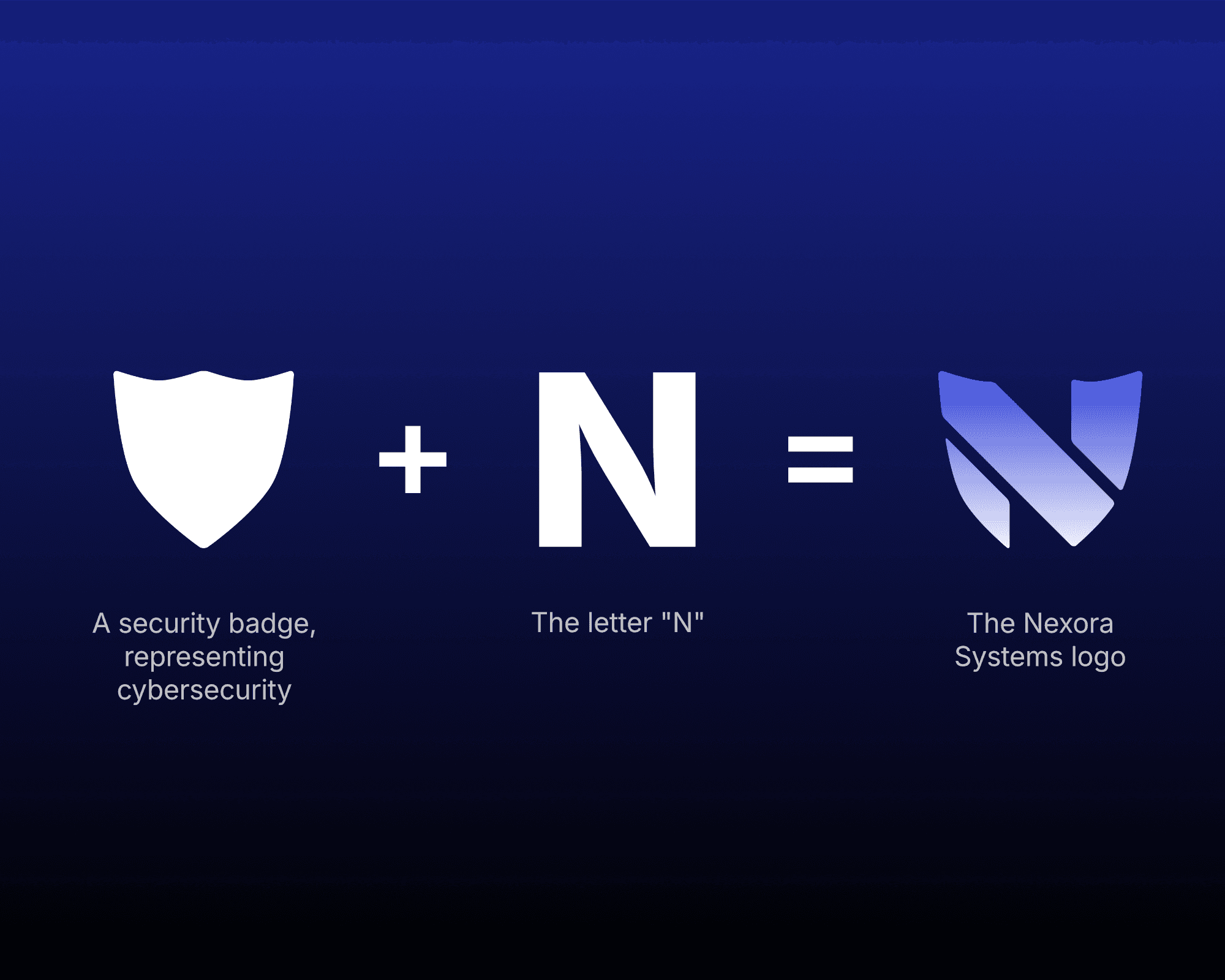
The Nexora Systems logo is the letter N, formed within the shape of a shield. The shield is one of the oldest and most universally understood symbols of protection. For a cybersecurity brand, it felt like the right foundation.
The more interesting design challenge was making the N feel native to that form, rather than simply placed inside it. The letterform was shaped to follow the geometry of the shield itself. The strokes and angles of the N align with the shield's structure, so the two feel like a single, unified mark rather than a letter sitting inside a container. The result is a logo that reads as both a wordless symbol and a brand initial at the same time.
COLOR & TYPOGRAPHY
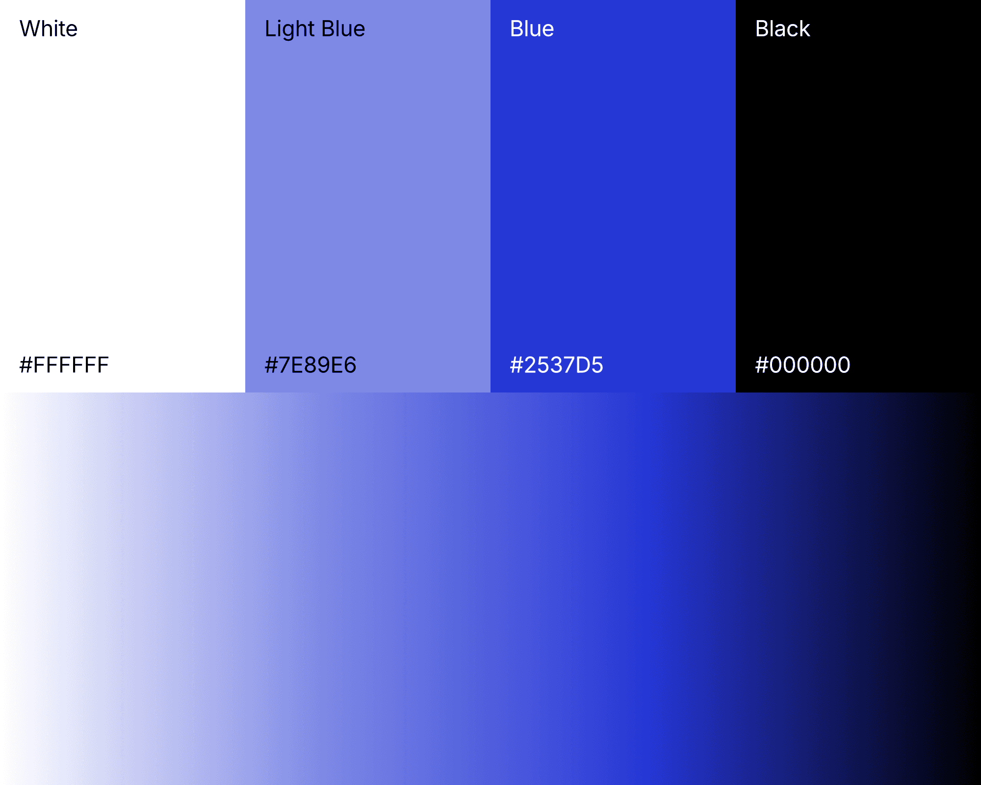
The color palette came together quickly and was built on trustworthiness and professionalism. Pure white and deep black form the structural backbone of the palette. These colors offer high contrast and a neutral base that doesn't draw attention away from important design elements.. It's a choice that communicates precision and clarity above all else.
The electric blue accent is the heart of the whole palette. This accent gives the brand its personality. Used sparingly, it injects energy and draws the eye exactly where it needs to go. Too much of this electric accent would feel too aggressive, but too little of it would leave the brand feeling lifeless.
Inter became the brand's primary typeface, and not just because it's become a staple in the tech world. The typeface earns its place here. The letterforms are clean without being sterile, and it holds up at all scales without losing legibility.
BUILDING THE WEBSITE
The biggest mistake you can make when moving from brand identity to website is treating them as two separate projects. The Nexora Systems website had to feel like a direct extension of the visual identity, expressing the same logic, energy, and sensibility.
The layout was designed to be clean, intentional, and free from clutter and unnecessary sections. The hierarchy is clear, the whitespace is generous, and the structure guides the eye naturally from one section to the next.
Subtle scroll-based animations, entrance transitions, and dynamic motion elements brought the site to life and gave it a sense of momentum, making the content feel alive and responsive rather than static.
To push the digital presence a step further, custom 3D elements were built in Spline and integrated directly into the website. The 3D assets add a layer of depth and interactivity that flat design simply can't replicate.


THE RESULT: A COHESIVE EXPERIENCE
At the end of this project, we were left with an identity that feels cohesive across every touchpoint. Everything speaks the same language, and that makes the final experience land. For a brand in this space, where the market is competitive and high-stakes, a unified presence and clear identity makes a real difference.