CASE STUDY:
STEP-BY-STEP



SCROLL
PROJECT DETAILS
Step-by-step is a community-driven running club that helps people grow together by learning pace, rhythm, and consistency step-by-step
Step-by-Step is a community-driven running club built on the idea that progress happens gradually—through pace, rhythm, and consistency. The brand focuses on supporting runners of all levels, encouraging members to grow together and celebrate small wins along the way.
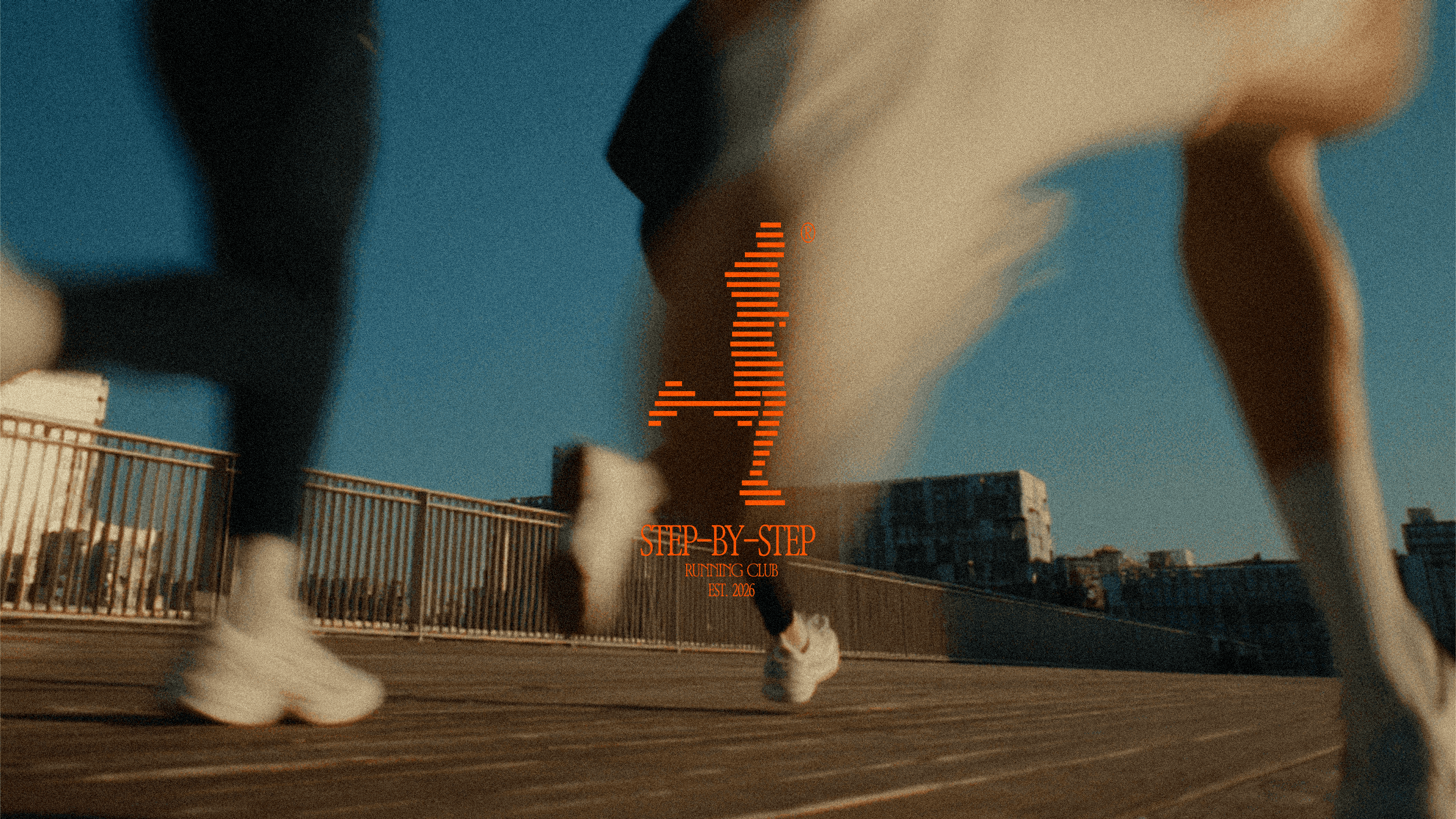
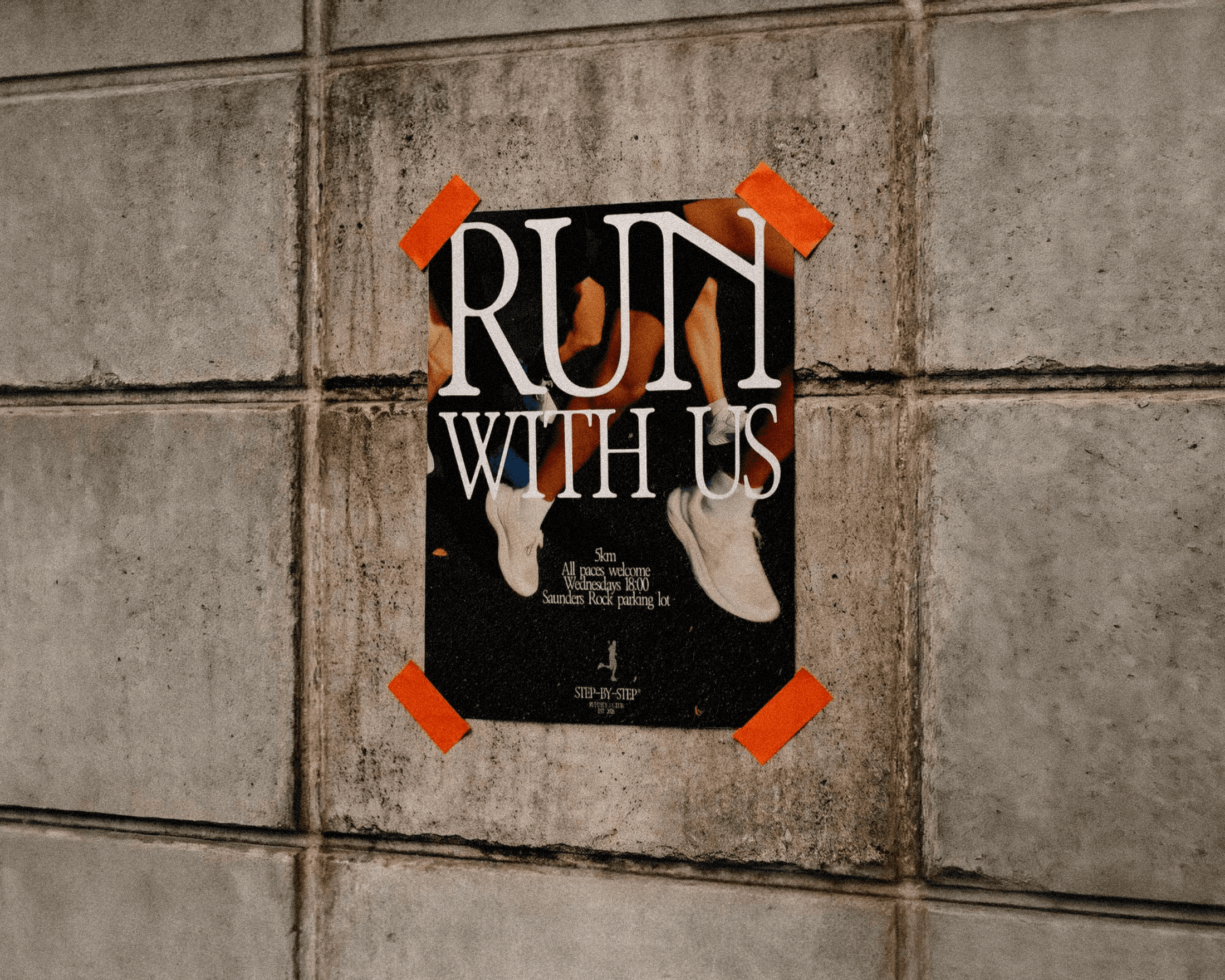
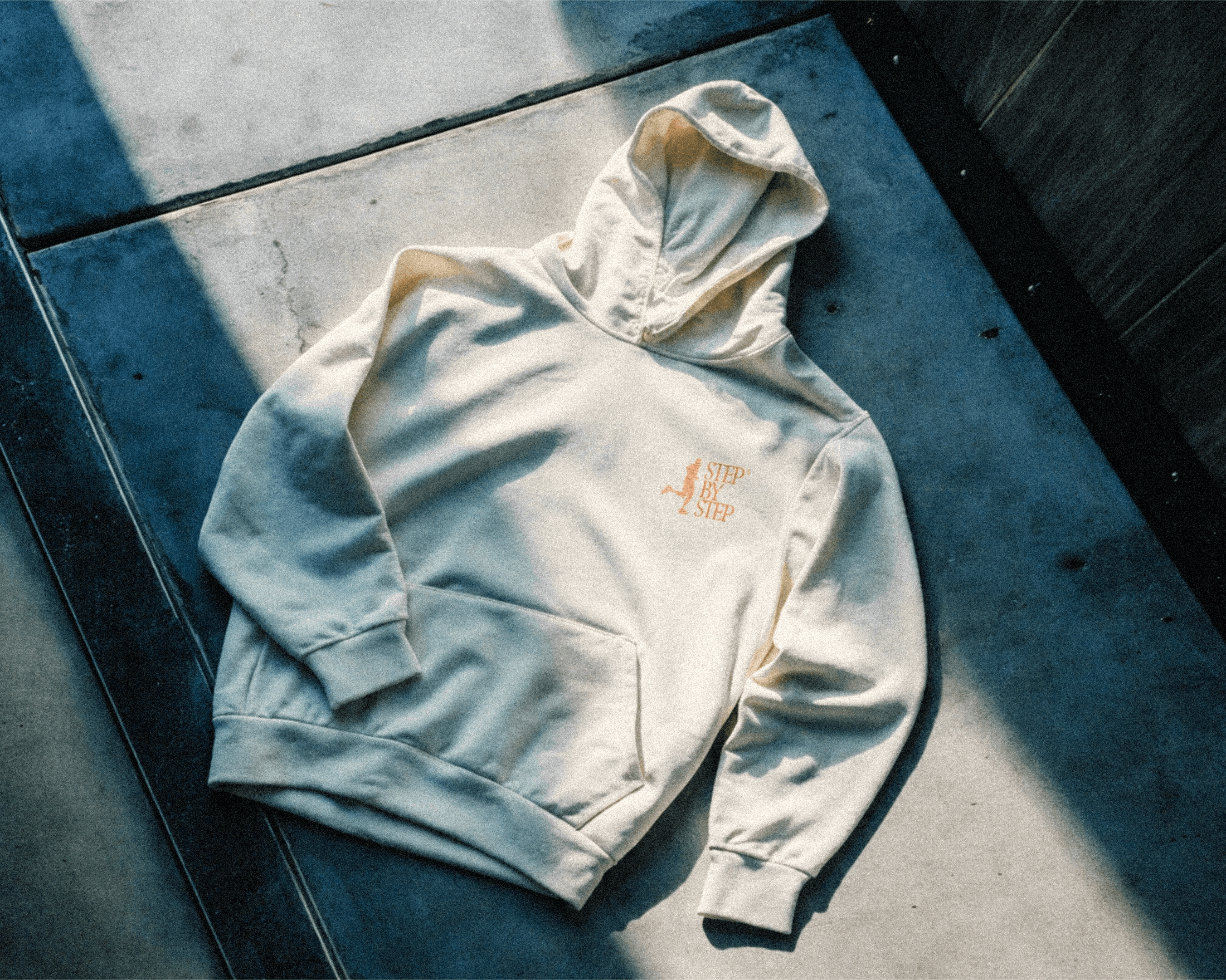
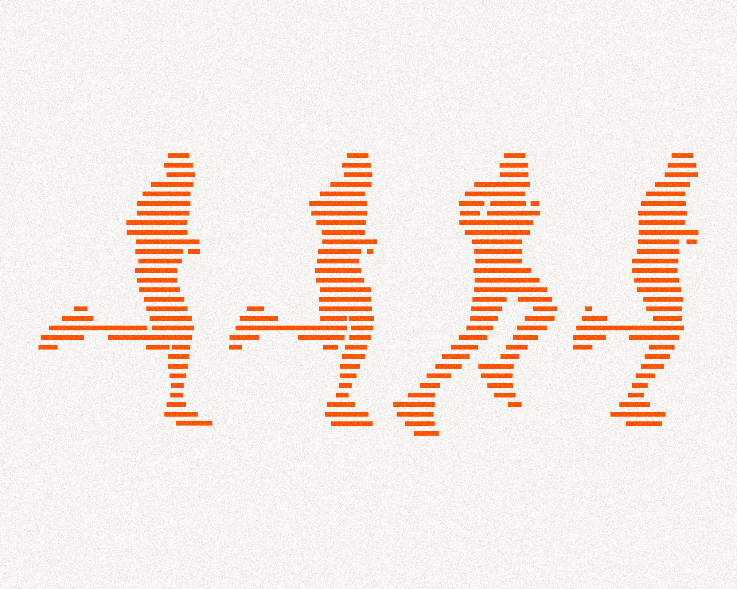
The visual identity centers around a pixelated running figure, designed using block-like shapes that resemble steps. This concept visually reinforces the brand name and philosophy: progress happens one step at a time. The simplified style ensures versatility across applications while maintaining a bold, recognizable presence.
The identity balances movement and structure, reflecting both the rhythm of running and the steady discipline required to improve.
INDUSTRY
Sports & Fitness
YEAR
2026
SERVICES
Branding & Merch Design


FINDING THE CONCEPT
Before I touched a single tool, I spent time sitting with the name — Step-by-Step. The name is both literal and metaphorical. It speaks to running, yes, but also to patience, process, and building something one piece at a time. This dual meaning became an important anchor in this visual identity system.
The goal for this identity was to make progress visible. I wanted to design something that doesn't just represent a running club, but actually embodies the feeling of moving forward steadily.
THE LOGO: A RUNNER BUILT FROM STEPS
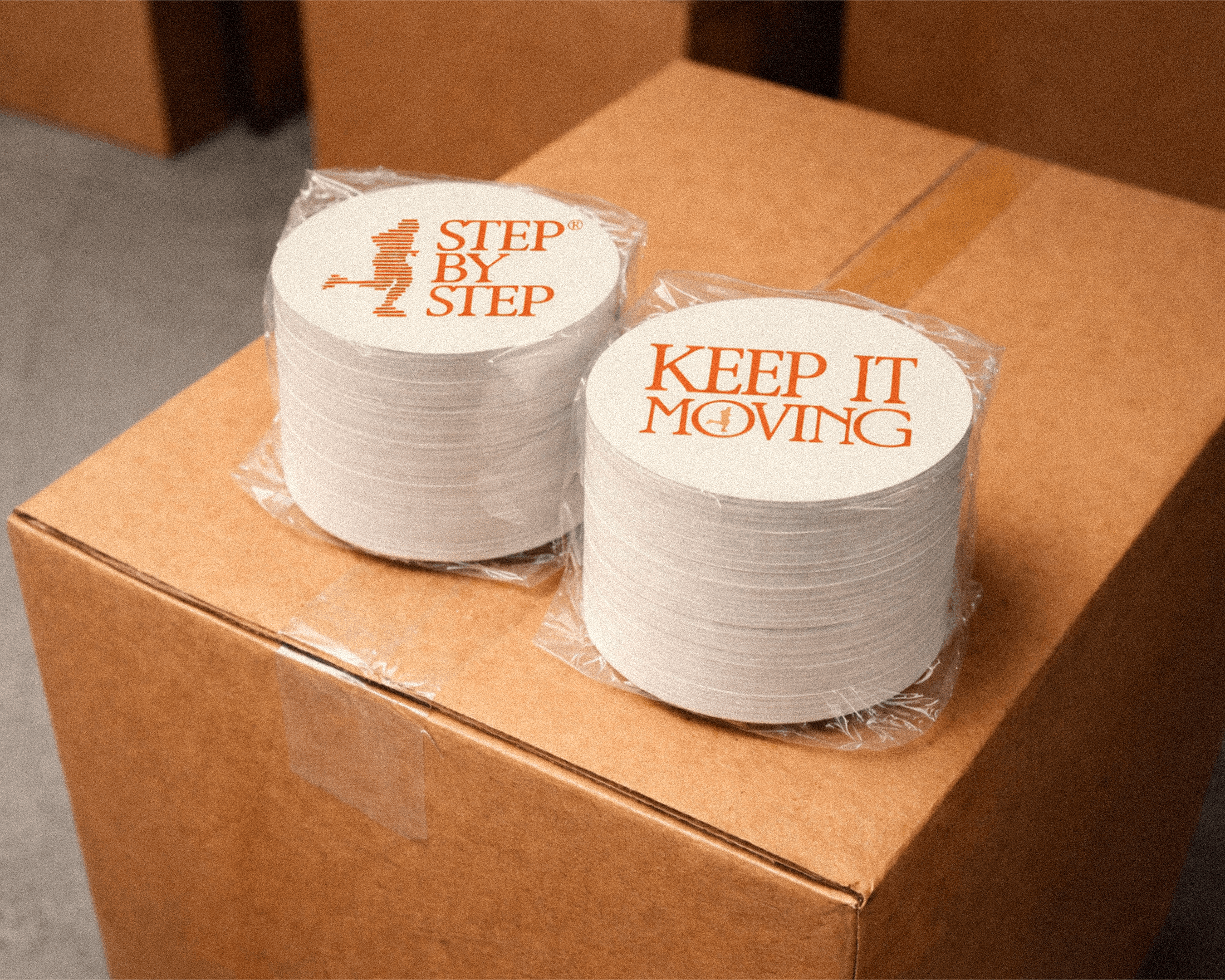
The logo is a pixelated running figure, but not in the way you might expect. Instead of a standard pixel grid, I constructed the figure using rectangular block-like shapes that resemble steps. Each block is a building block and each shape is a stride.
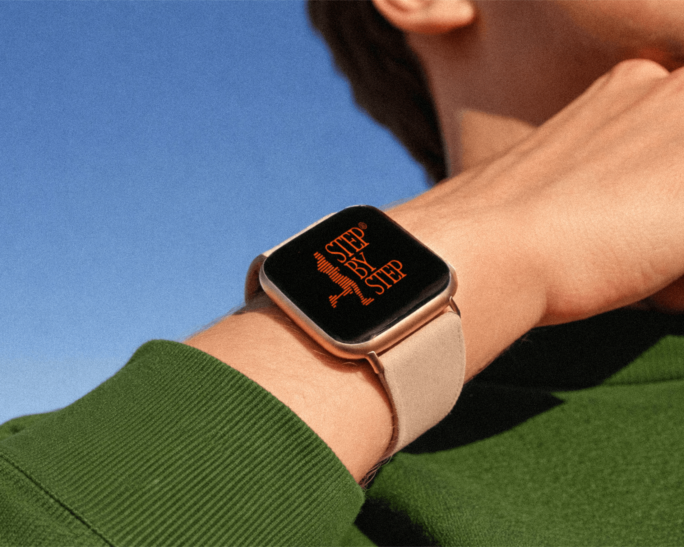
The simplified, blocky style also gave the mark instant versatility. It reads clearly at any size, works across light and dark backgrounds, and holds its own whether it's on a t-shirt, a phone screen, a sticker, or a race bib.
Once the static design was locked in, it needed to move. I turned the pixelated runner into an animation by adjusting the width of each rectangular block to reflect the runner's form across different positions in their stride. The figure runs frame by frame, moving rhythmically instead of smoothly or perfectly.
The staggered, imperfect movement of the pixel animation mirrors the imperfection of the running journey itself. You don't glide through progress. You work through it, one frame at a time.
COLOR: BOLD, WARM, & FULL OF ENERGY
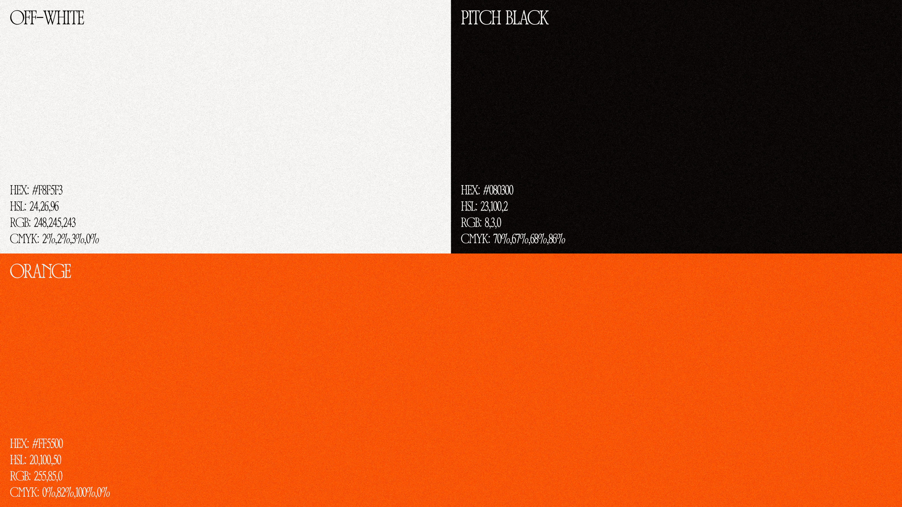
The color palette is built around three core colors: a soft cream off-white, a warm off-black, and a bold, bright orange.
The orange does the heavy lifting. It's active, energetic, and alive – the kind of color that pulls your eye across a page. It also fits the retro aesthetic naturally, nodding to the era of bold athletic branding before everything became minimal and muted.
The cream and off-black keep things grounded. Together, the three colors strike a balance between energy and warmth – approachable but confident and vibrant but not aggressive.
TYPOGRAPHY & TEXTURE
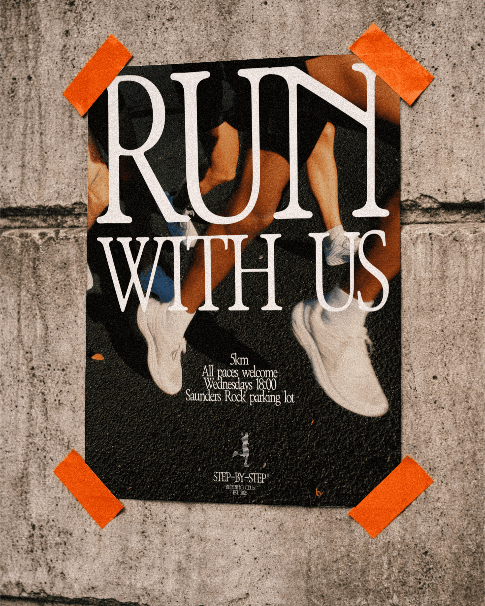
The core typeface for this identity is ZT Bros Oskon 90's — a retro-inspired serif with just enough character to feel distinctive without being loud. It anchors the identity in a different era that feels more analogue, physical, and present.
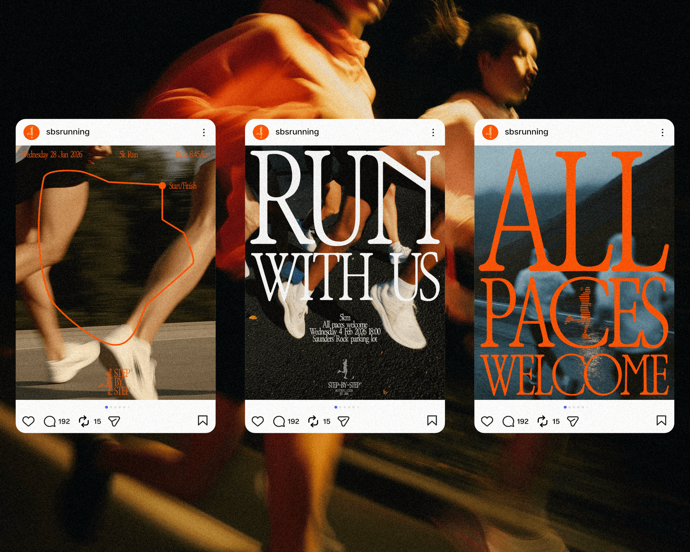
Paired with grainy, textured photography throughout, the overall aesthetic pulls from vintage athletics. The identity draws inspiration from a time before everything was digital and before community meant followers. A time when people gathered in person, trained in groups, and measured progress with their bodies rather than their metrics.
There's something intentional about that reference for a brand like Step-by-Step. A running club is, at its core, a deeply human, deeply social thing. The retro aesthetic reinforces that.

BRINGING IT TOGETHER
What I love most about this project is how cohesive the concept feels across every layer. The logo is built from steps. The animation shows the act of running. The color communicates energy. The typeface and texture root everything in community and human connection.
Nothing is decorative for the sake of it. Every decision traces back to the same idea: progress happens one step at a time, and it's better when you're not doing it alone.
That's the story Step-by-Step tells – and it was my job to make sure the visuals told it just as clearly as the words do.